Are you ready to breathe new life into your bathroom? If you’re seeking a way to infuse personality and vibrancy into one of the most frequently used spaces in your home, look no further than the transformative power of bold two-tone colors. This innovative design technique offers a refreshing twist,allowing you to create a striking contrast that can elevate the ambiance of your bathroom from ordinary to exceptional. Whether you’re aiming for a calming retreat or a lively oasis, the right color combination can set the tone and create a space that not only meets your functional needs but also reflects your unique style. Join us as we explore the art of two-tone color schemes and discover how you can embrace this trend for a stunning bathroom makeover that’s sure to impress.
Transform Your Bathroom Aesthetic with Vibrant Two-Tone Color Combinations
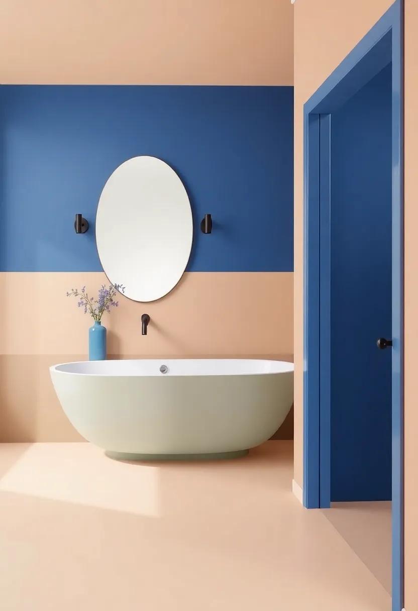
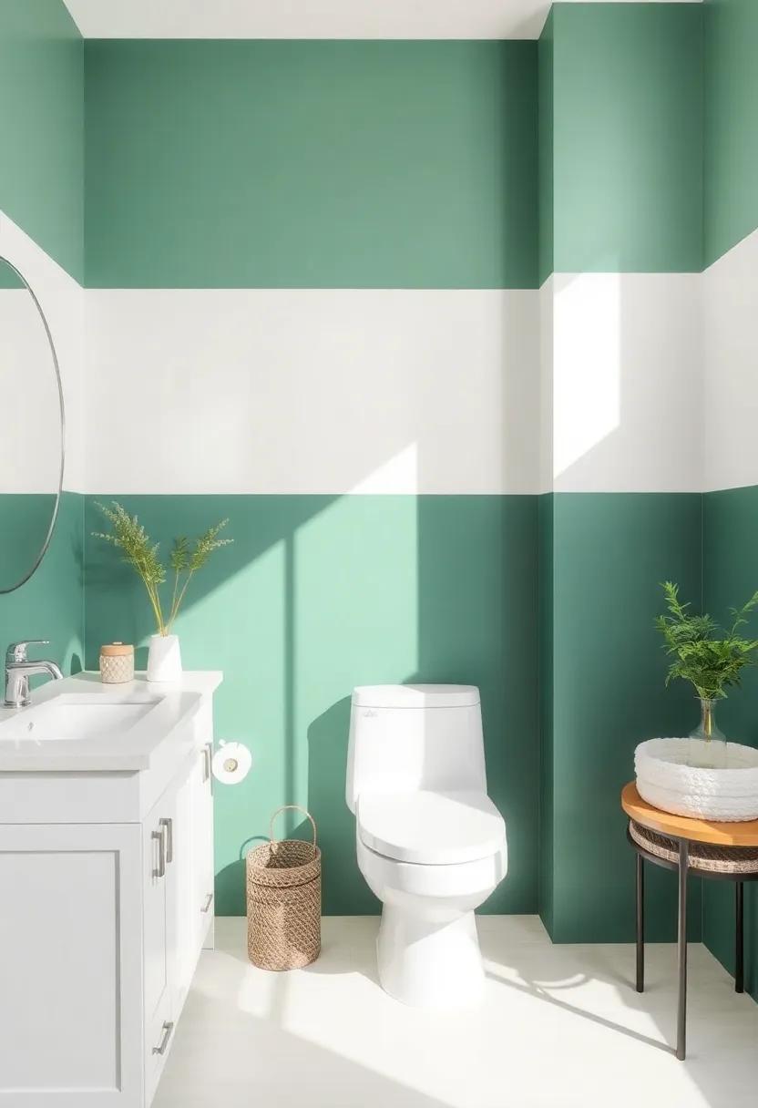
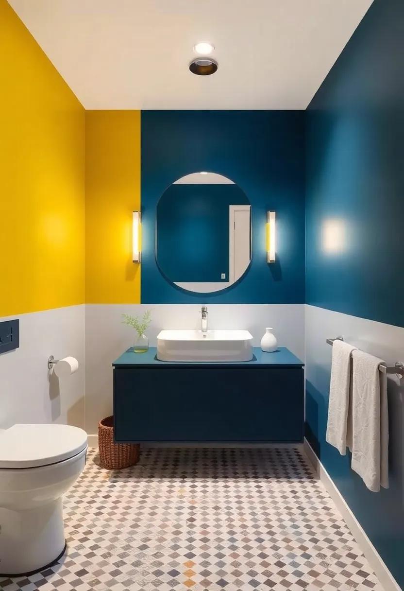
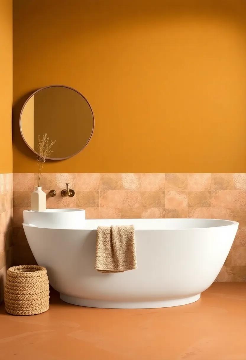
Revamping your bathroom with vibrant two-tone color combinations can elevate the entire atmosphere of the space, turning it into a captivating retreat. Imagine pairing a soothing seafoam green with crisp white for a fresh coastal vibe, or opting for bold navy blue against radiant golden yellow to create a dramatic, yet inviting feel. These combinations not only enhance visual interest but also help in defining areas within your bathroom, such as distinct zones for the shower and vanity, making even the smallest of spaces feel larger and more structured.
Consider the elegance of charcoal gray with a splash of blush pink; it brings a modern touch while maintaining a sense of warmth. To make it even more exciting, you could add textured elements like a geometric tile pattern in one color against solid paint in another. Don’t shy away from incorporating accessories and décor that complement your color scheme, such as towels, rugs, and artwork. For inspiration, explore color palettes on Pantone and see how you can harmonize your choices to achieve a serene and stylish bathroom sanctuary. Pantone provides a wealth of resources to guide you in this colorful journey.
Exploring Color Psychology: the Emotional Impact of Two-Tone Bathrooms
Color plays a pivotal role in setting the mood and ambiance of any space, and bathrooms are no exception. When opting for a two-tone color scheme,consider how different hues can evoke various emotional responses. For instance,pairing calming blues with vibrant yellows can create a serene yet energizing environment,perfect for starting your day on a positive note. Additionally, the use of soothing greens alongside crisp whites can instill a sense of balance and tranquility, transforming your bathroom into a personal sanctuary. It’s essential to choose colors that resonate with your personal taste while also being mindful of the feelings they may evoke.
Implementing a two-tone design strategy not only enhances the aesthetic appeal but also brings dynamism to what might otherwise be a mundane space. Whether you decide on subtle contrasts or bold pairings, the emotional impact can vary widely. Consider incorporating contrasting elements, such as textured tiles and smooth finishes, to enhance depth. You might also explore temporary accents using fresh plants or decorative towels that complement your chosen colors.Embrace the tool of color psychology and turn your bathroom into a haven that reflects your personality while nurturing your well-being. For more insights on how color influences emotions, you can visit colorpsychology.org.
Choosing the Perfect Color Palette: Complementary Shades for a Stunning Look
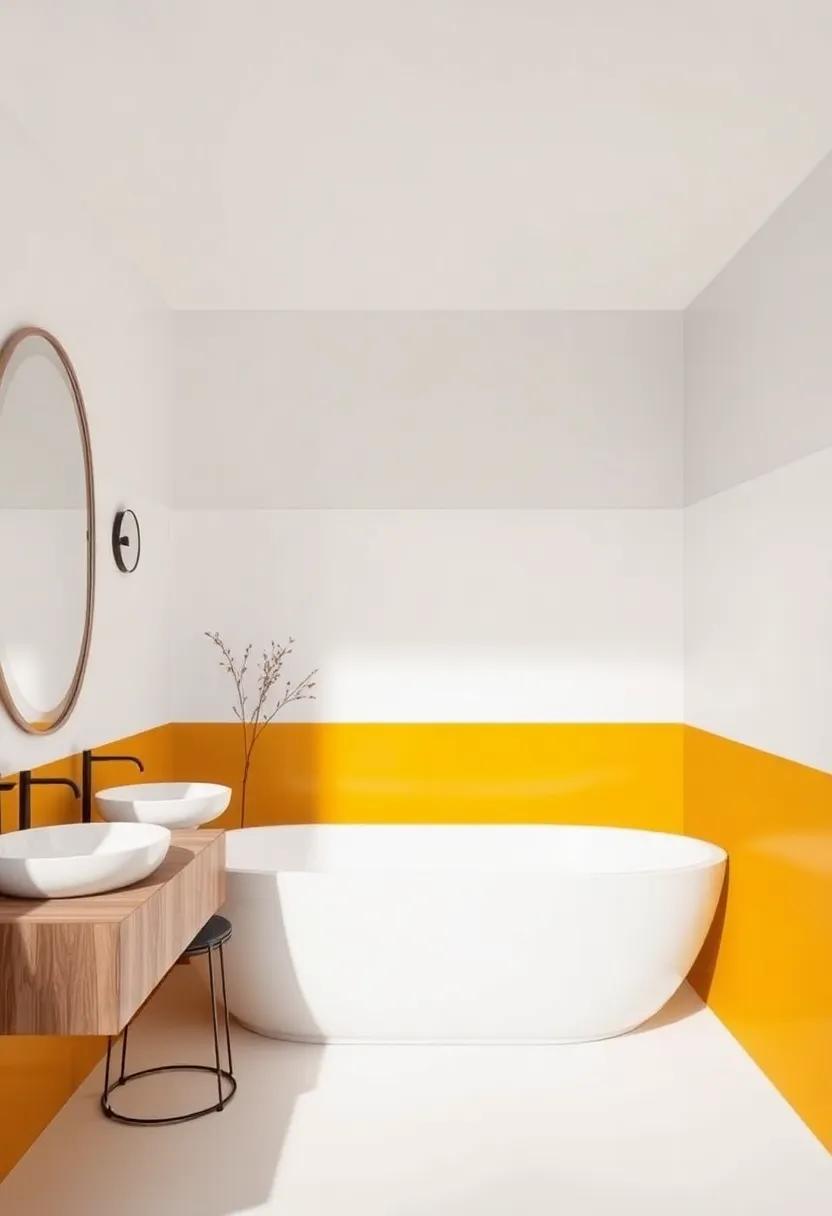
When embarking on a bathroom makeover, the right color palette can make a world of difference, transforming a mundane space into a stunning sanctuary. complementary shades are a brilliant way to achieve a harmonious look while also adding depth and vibrancy. consider pairing deep navy blue with a soft coral hue, or perhaps rich emerald green alongside a warm, sunny yellow.These combinations not only create visual interest but also evoke a sense of balance, inviting relaxation and rejuvenation after a long day.
to make the selection process easier, visualize your potential color pairings with the help of a simple table outlining some popular complementary color combinations:
| Base Color | Complementary Shade |
|---|---|
| Charcoal Gray | Rose quartz |
| Teal | Burnt Orange |
| Soft lavender | Mustard Yellow |
| Classic Beige | Turquoise |
As you explore your options, don’t hesitate to seek inspiration from websites like color-hex.com, where you can find an array of palettes and ideas tailored to your unique aesthetic.By thoughtfully choosing your colors, you’ll be on your way to creating a stunning and inviting bathroom that reflects your personal style.
Incorporating Natural Light: How Two-Tone Colors Work with Your Space
When designing a bathroom with bold two-tone color schemes, the role of natural light cannot be overstated. The interplay between shades can be magnified through well-placed windows or skylights that allow sunlight to flood the space. Rich, darker colors can add depth and drama, while lighter hues enhance brightness and openness. Here are some ideas to effectively integrate natural light:
- Strategic placement: Position mirrors opposite windows to reflect light and create an illusion of a larger space.
- Translucent Elements: Consider using frosted glass partitions or light-colored textiles that diffuse natural light while maintaining privacy.
- Contrasting Colors: Use darker tones on lower surfaces like vanities or lower walls to ground the design, allowing lighter colors to shine at eye level and above, accentuating the brightness.
Incorporating these design elements not only brightens your bathroom but also enhances the appeal of your chosen two-tone palette. A delicate balance of color can transform the warmth of natural light, emphasizing the beauty of your chosen hues. To explore more about how to harness light in your design, check out Architectural Digest for expert tips and inspiration.
| Color Pair | Effect |
|---|---|
| Charcoal & Soft Mint | Creates a modern, tranquil vibe |
| Navy & Crisp White | Adds sophistication and brightness |
| Warm Beige & Deep Taupe | Offers a cozy, inviting atmosphere |
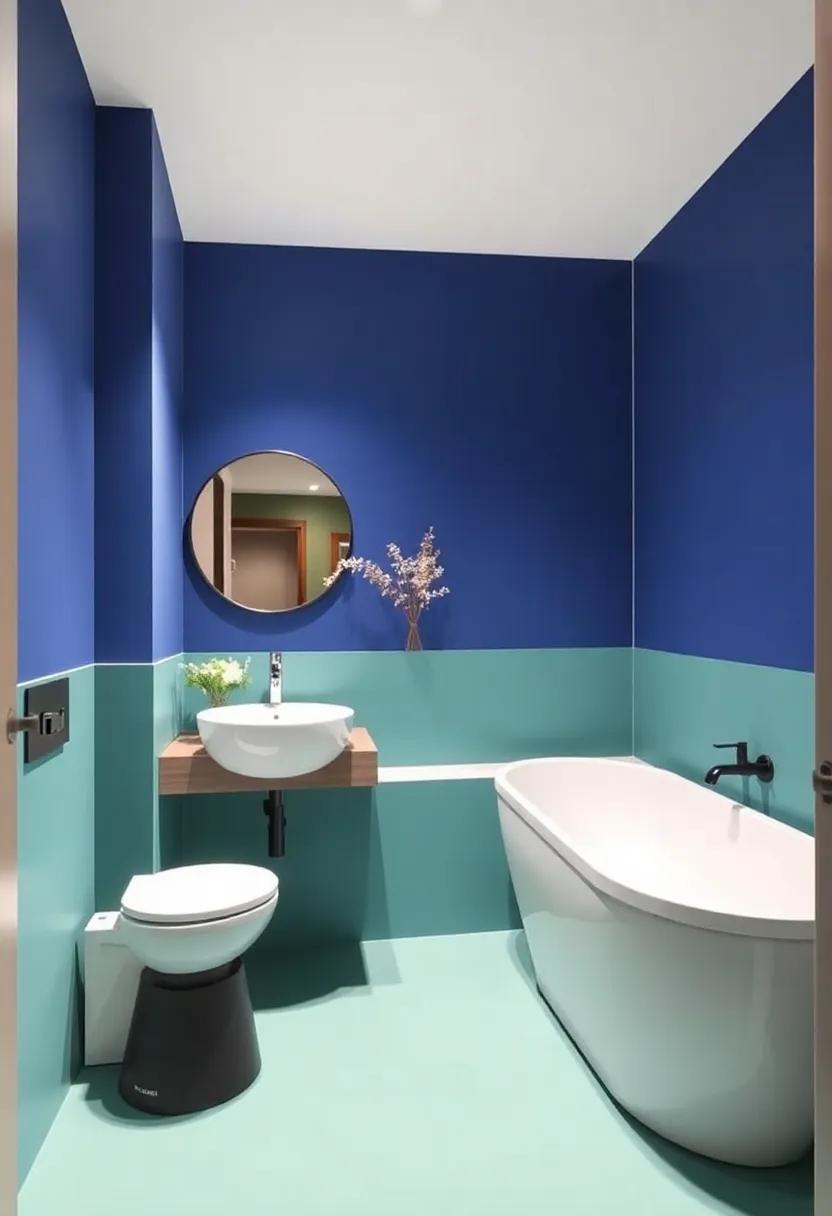
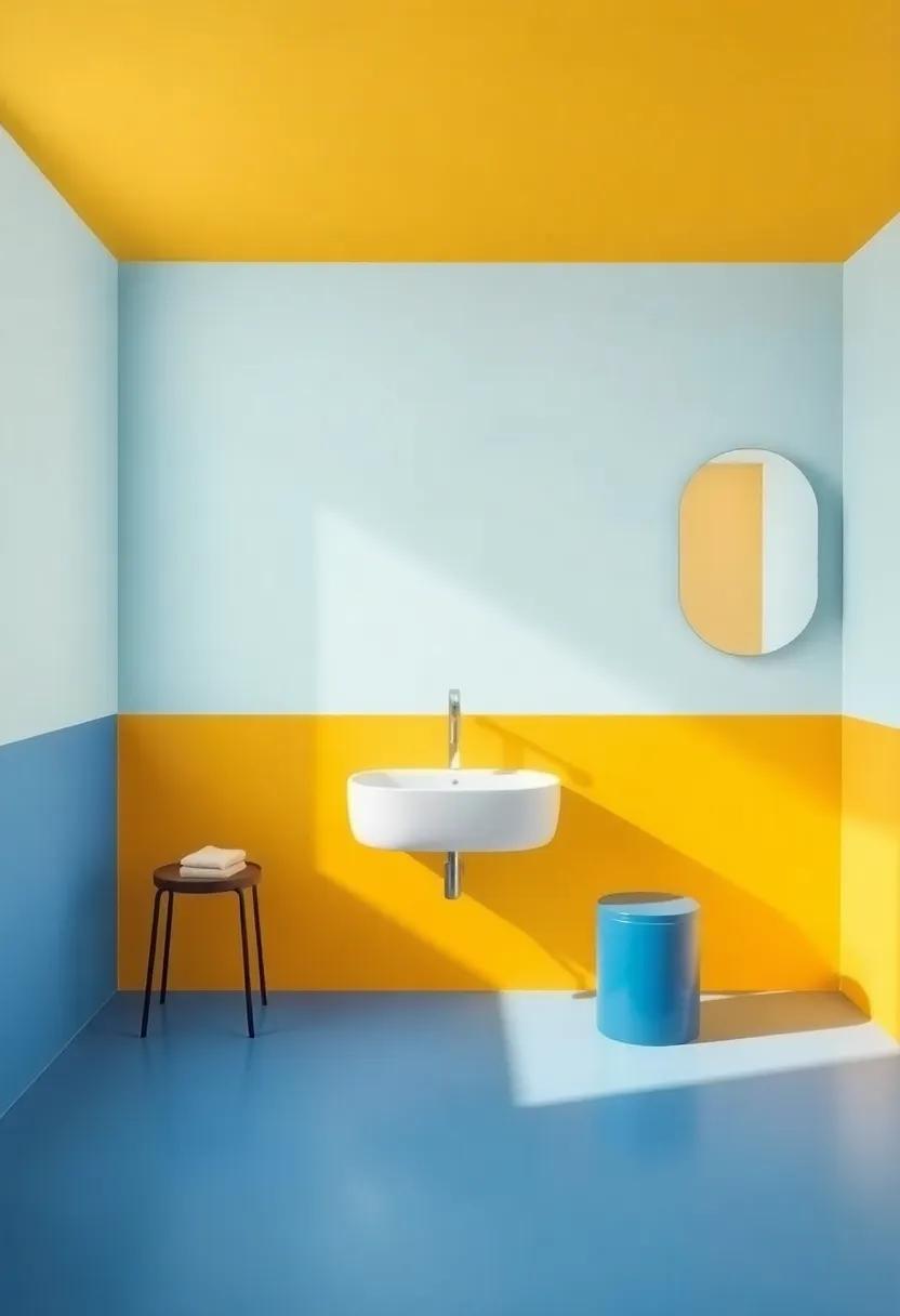
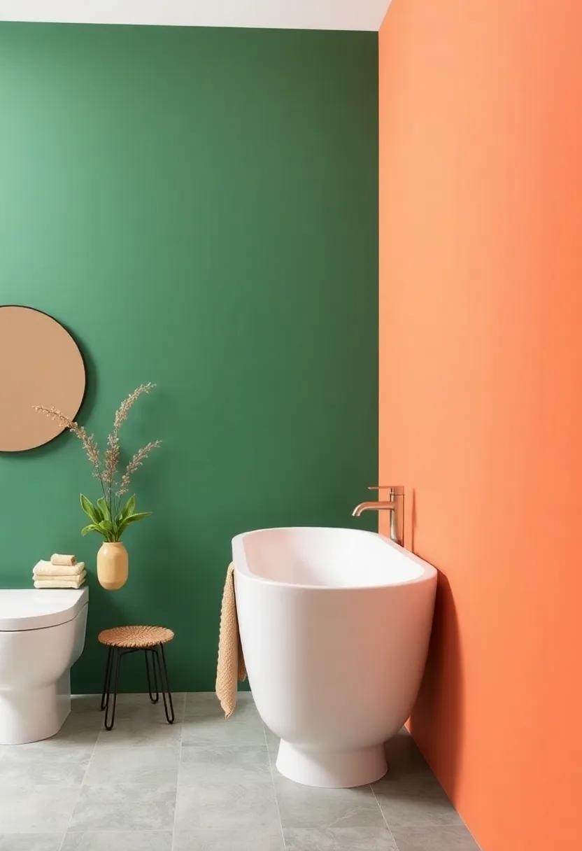
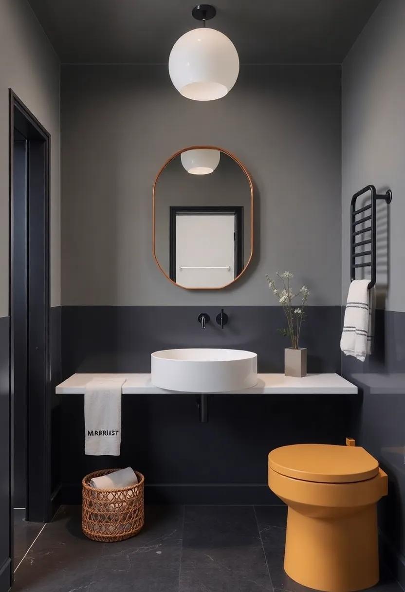
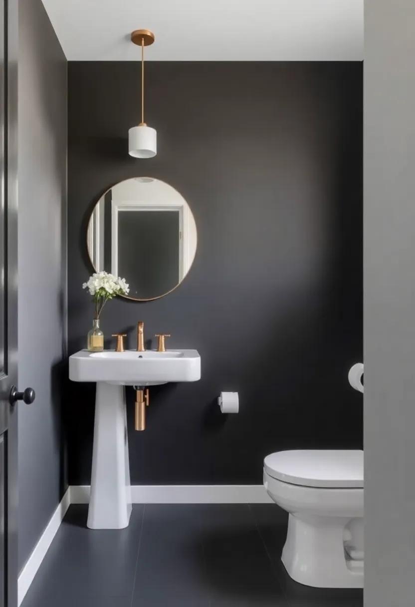
Experimenting With Contrasting Colors for a Bold Bathroom Statement
When it comes to revamping your bathroom, few techniques make as striking an impact as the use of contrasting colors.By pairing two distinct tones, you can create an eye-catching aesthetic that draws the eye and showcases your personal style. To achieve a truly stunning look, consider some popular combinations such as:
- Deep navy blue paired with vibrant gold
- Charcoal gray and soft blush pink
- Forest green contrasted with crisp white
- Rich plum and fresh mint
These bold duos not only add depth to your space but also enhance the overall architecture of your bathroom.to further emphasize the contrast, consider integrating diverse materials and textures.A sleek matte finish can help highlight a glossy tile, while adding elements of wood or metal can provide dimension. To illustrate this idea, here’s a simple breakdown of how different elements work together:
| Color Pair | material | Finish |
|---|---|---|
| Deep Navy & Gold | Marble Countertop | Polished |
| Charcoal & blush | Wood accents | Matte |
| Forest Green & White | Glass Fixtures | Glossy |
| Rich Plum & Mint | Ceramic Tiles | Textured |
By selecting complementary colors and contrasting finishes, you can turn your bathroom into a dynamic work of art that exudes personality. For more inspiration, visit Houzz to explore countless examples of innovative color combinations and designs that can elevate your space!
Creating a Focal Point: Using Two-Tone Design to Highlight Features
Incorporating two-tone colors into your bathroom is an innovative way to create a striking focal point that enhances the aesthetics of the space. Consider using contrasting colors for key features, such as vanities or accent walls. This technique can dramatically elevate the room’s overall vibe,turning mundane elements into eye-catching highlights. Some effective color pairings include:
- Deep navy and crisp white: Ideal for a classic, nautical feel.
- Soft sage and warm beige: Perfect for a serene, nature-inspired ambiance.
- Bold charcoal and vibrant mustard: A contemporary combination that adds energy.
When applying this design approach, balance is key.You can designate one color for larger surfaces,like the walls,while reserving the second color for smaller elements,like trim or cabinetry. This not only grounds the space but also adds depth. To see examples and inspirations for two-tone bathroom designs, visit Houzz, where a myriad of styles can spark your creativity.
Selecting the right Materials: Paint, Tiles, and Textiles for Two Tones
Selecting materials for your two-tone bathroom makeover sets the stage for a stunning transformation. When choosing paint, opt for moisture-resistant options such as eggshell or satin finishes to withstand the damp environment while providing a soft sheen. Lighter shades paired with vibrant accents can create a spacious feel, while deeper tones can add a touch of intimacy. For a cohesive look, consider painting one wall in a bold hue, with complementary colors on the remaining walls for a balanced aesthetic.
Tiles and textiles are essential for tying the design together. Mosaic tiles can effectively introduce intricate patterns that break monotony, while large-format tiles lend a seamless visual appeal. Choose textiles such as towels, shower curtains, and bath mats in colors that echo your chosen palette. A combination of rich fabrics and lightweight materials can create depth, while thoughtful layering enhances texture. Here’s a simple guide to getting started:
| Material | Recommended Color Pairing |
|---|---|
| Paint | Soft Gray & Turquoise |
| Tiles | White Subway & Navy Accent |
| Textiles | Neutral Patterns & Bold Solids |
For inspiration and further insights into color combinations, visit color.com.
Innovative Ideas for Two-Tone Accents and Decor in Your Bathroom
one of the most effective ways to incorporate two-tone accents in your bathroom is through your cabinetry and fixtures.Consider painting your lower cabinets in a bold color, such as deep navy or emerald green, and pairing them with a lighter shade on the upper cabinetry, like soft white or light gray. This technique not only draws the eye upward, making the space feel larger, but also creates a striking contrast that enhances the overall aesthetic. Additionally, you can opt for two-tone tiles for your backsplash — choose vibrant hues for the lower half, while the upper portion features a subtle shade to add balance. This delightful juxtaposition will ensure that your bathroom becomes a visual feast.
An exciting approach to two-tone decor is to utilize accessories that can easily be changed with trends or seasons. Think of plush towels in a mix of bold colors that complement the overall palette, or shower curtains that introduce a vibrant splash against a more neutral wall. You can even accessorize with varying shades of plant pots to introduce cohesive yet playful greenery. To make a statement, why not use a two-tone mirror frame? Opt for a stylish oval or rectangular mirror that combines contrasting colors—like black and natural wood—that frames your reflection beautifully. For more inspiration on color selections,look no further than Dulux, which offers a plethora of color ideas and combinations.
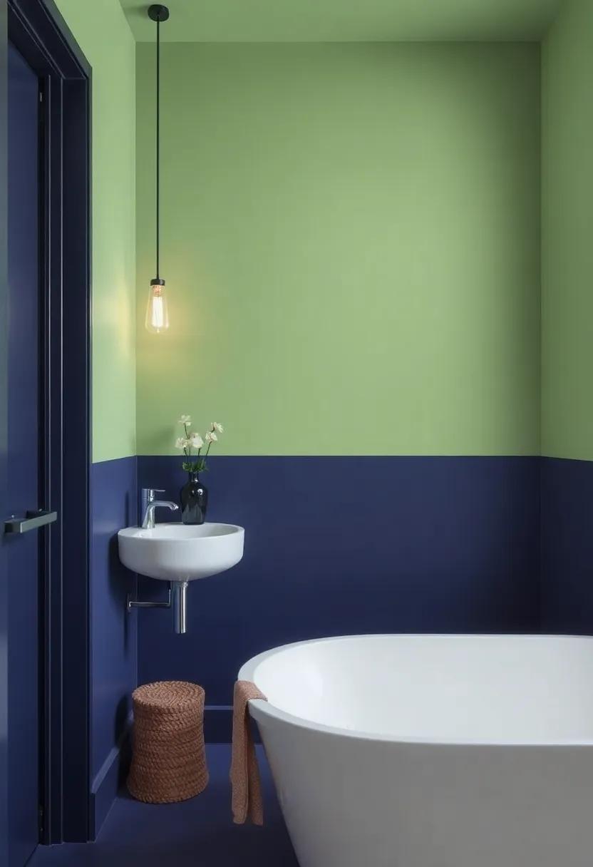
Visual Flow: Ensuring Consistency in Color Transitions from Room to Room
To create a harmonious flow between rooms, it’s essential to maintain consistency in your color transitions. When choosing two-tone colors for your bathroom, consider selecting shades that complement each other while also linking back to adjacent spaces. Such as,if your hallway features a warm beige,a similar hue with a bold accent,like navy blue,can enhance the allure of your bathroom. This approach not only ties the rooms together but also invites a sense of continuity throughout your home.
To achieve this visual cohesion, pay attention to the following elements:
- Color Palette: Choose a cohesive palette that translates easily from one room to another.
- Accent colors: Use bold accents selectively to draw attention, ensuring they are echoed in adjoining spaces.
- Materials and Textures: Incorporate similar materials or textures, like matte finishes or glossy tiles, to enhance the visual connection.
- Lighting: Consider how light interacts with your chosen colors, as it can dramatically affect the perception of continuity.
By paying close attention to these elements, you can create a wonderfully cohesive environment that invites exploration and comfort throughout your home. For additional inspiration and guidance on color theory, visit Houzz.
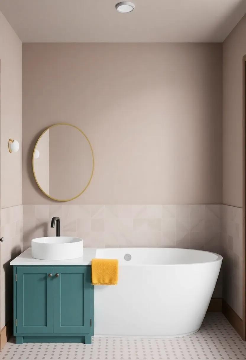
The Power of Neutrals: Pairing Bold Colors with Calming Shades
Combining bold colors with calming shades can create a harmonious and visually stunning bathroom environment. Incorporating rich tones such as deep blue or forest green alongside soft neutrals like creamy beige or gentle gray can enhance the space’s overall appeal. To achieve this inviting aesthetic, consider using the following elements:
- Accent Walls: Choose a bold color for one wall to serve as a striking focal point while keeping the other walls in a soothing neutral tone.
- Accessories: Introduce vibrant towels or a patterned shower curtain that incorporates both bold and calming colors, tying the entire look together.
- Artwork: Select wall art that features a balance of energetic hues mixed with softer shades to invigorate yet relax the ambiance.
Utilizing neutrals as a backdrop allows bolder choices to shine without overwhelming the senses. Such as, pairing a vivid coral sink with matte white cabinetry creates a refreshing contrast that still feels grounded.Here’s a simple table showcasing some popular colors and effective combinations:
| Bold Color | Calming shade |
|---|---|
| Deep Teal | Soft cream |
| Rich Burgundy | Warm Taupe |
| bright Mustard | cool Gray |
By thoughtfully integrating these colors, you can make your bathroom not only a functional space but also a rejuvenating retreat. For tips on color pairings, visit Colorado State university.
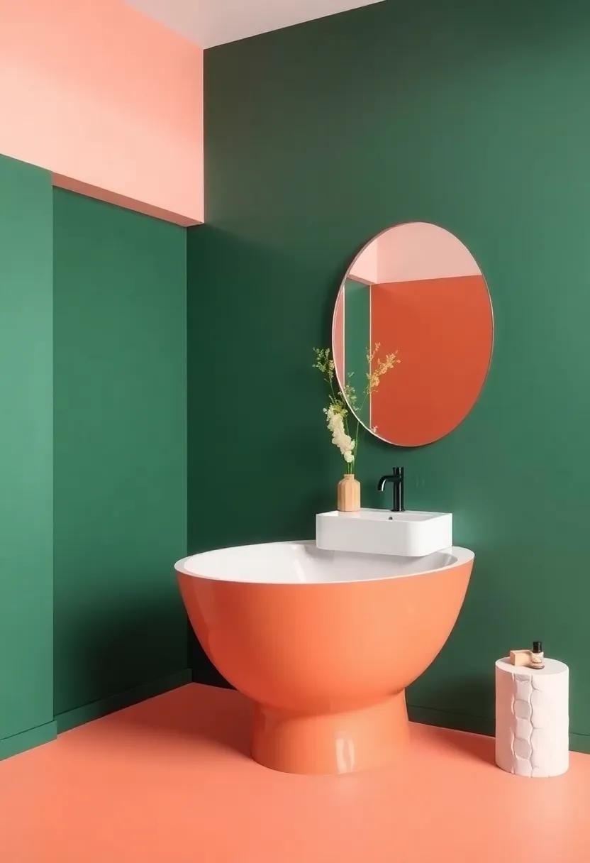
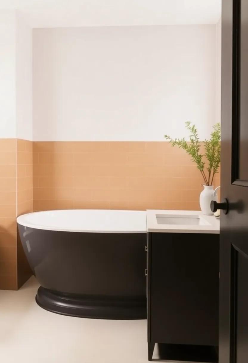
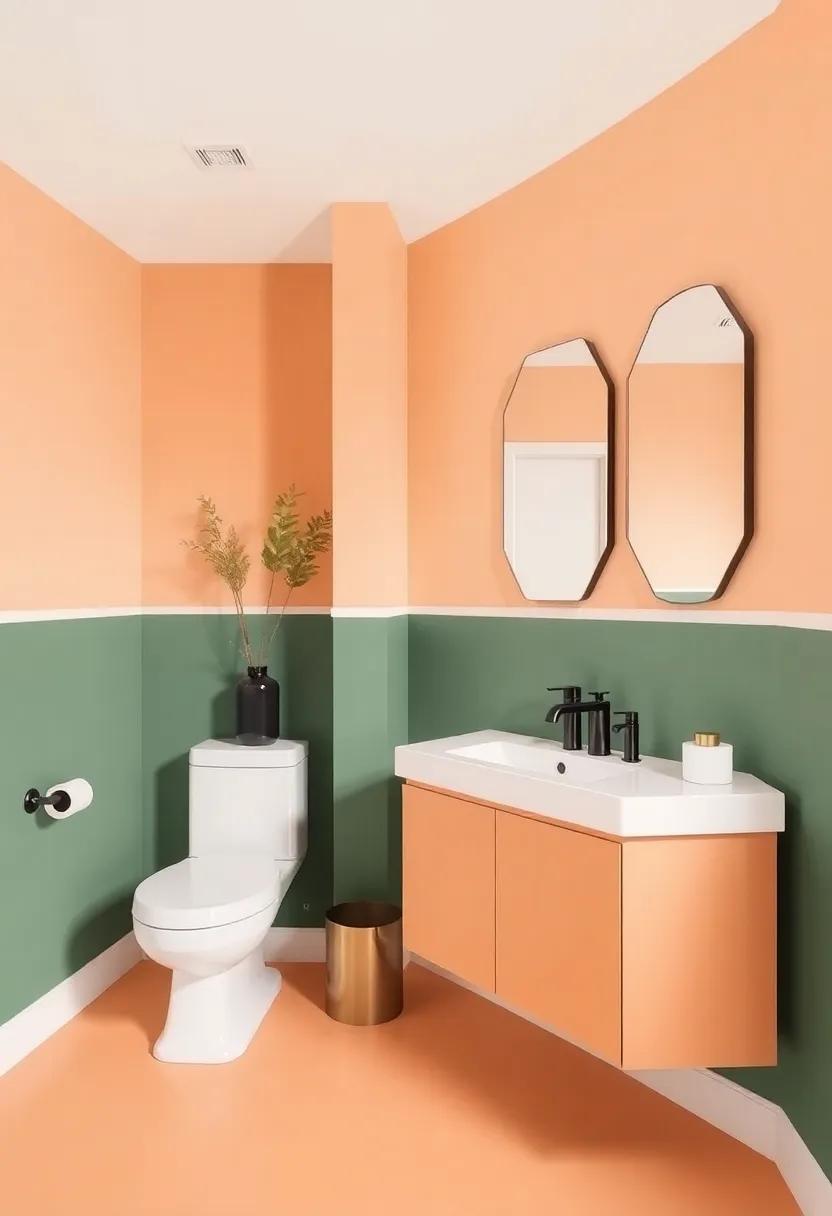
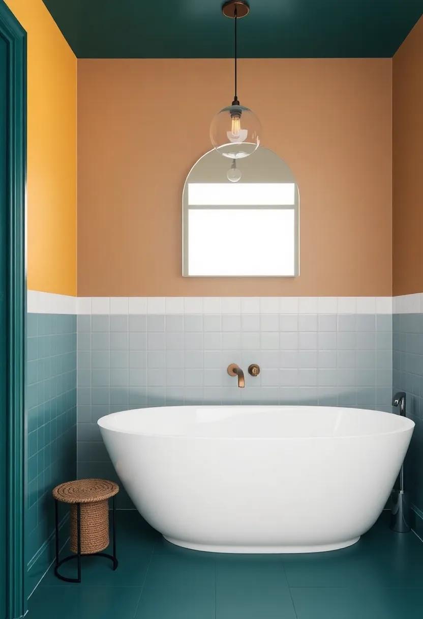
Inspiration from Nature: earthy Two-Tone Combinations for a tranquil Vibe
Drawing inspiration from the earth’s natural palette can create a serene atmosphere in your bathroom. Rich tones such as terracotta paired with deep forest green evoke the calming vibe of being surrounded by nature. Alternatively, combining gentle sand beige with a muted ocean blue can mirror the tranquil essence of coastal landscapes. These earthy pairings help to ground the space, inviting relaxation and a sense of peace, making every bathing experience rejuvenating.
To ensure your two-tone scheme resonates with nature, consider adding accents that mimic organic textures. Think of using materials like wood and stone in your decor or fixtures. Here’s a simple guide to help you choose complementary hues:
| Primary Color | Complementary Tone | Nature Reference |
|---|---|---|
| Rustic Brown | Soft Sage Green | Forest Floor |
| Sandy Beige | Seashell White | Beach Shore |
| Slate Gray | Rich Moss green | Mossy Rocks |
Incorporating these color combinations will allow you to create a unique sanctuary that feels both vibrant and harmonious. For more ideas on how to transform your space through color, visit Decorilla for additional inspiration and tips.
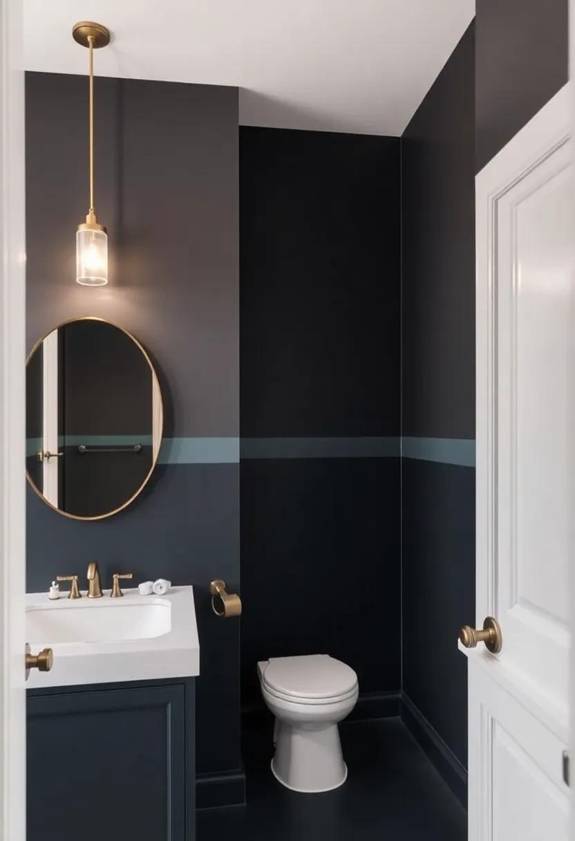
Enhancing Small Spaces: How Two-Tone Colors Can Open Up Your Bathroom
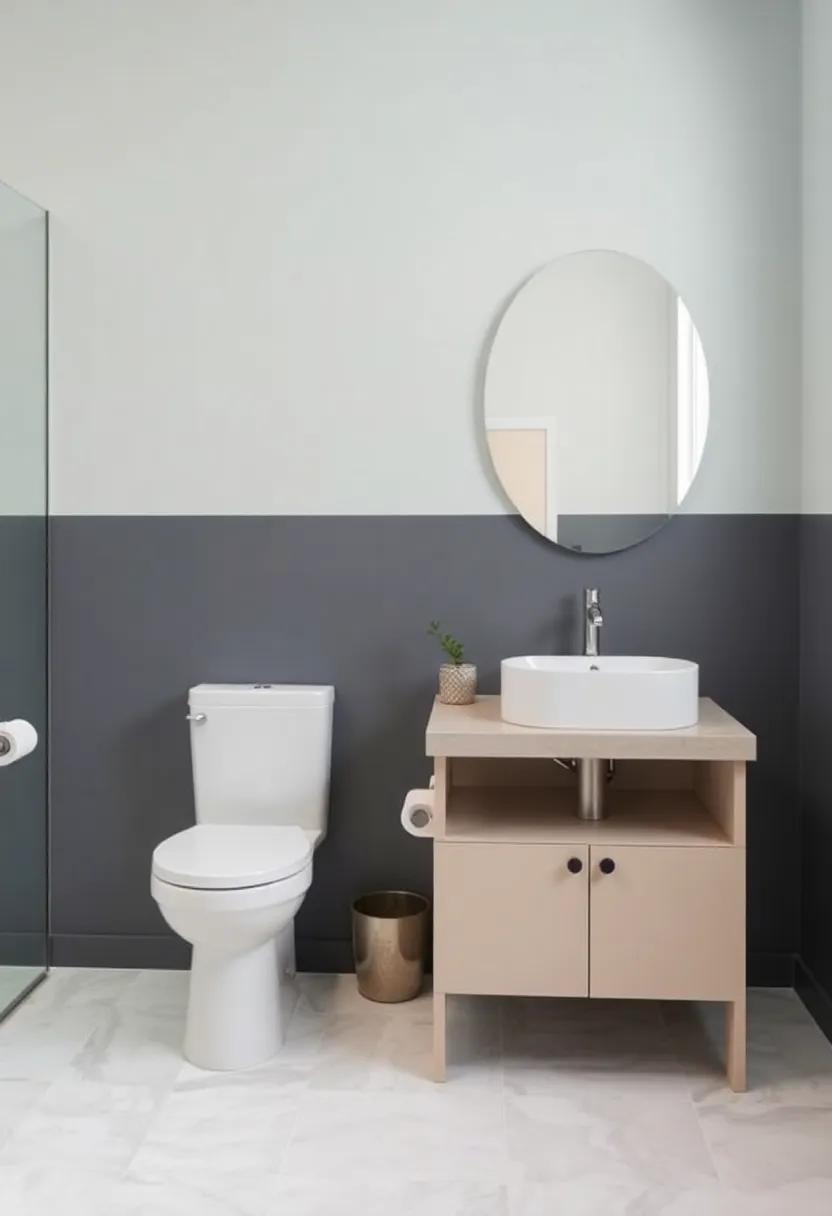
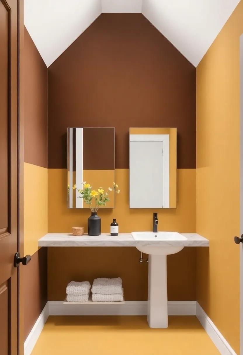
When it comes to small bathrooms, the right color scheme can work wonders in creating a sense of space and openness. using two-tone colors effectively can help to visually expand the area while adding an element of sophistication. one popular approach is to pair a light color on the upper walls or ceiling with a darker shade on the lower half. This contrast not only draws the eye upwards, enhancing the feeling of height, but also provides the chance to showcase beautiful tile work or decorative molding.Consider options like soft pastels combined with rich navy or muted greys paired with crisp whites to effortlessly elevate your bathroom’s aesthetic.
Additionally, incorporating two-tone styling on cabinetry or fixtures can shift the focus and add depth. By painting cabinets one color and leaving the hardware in a contrasting shade, you can create a visual anchor that diversifies the room’s look without overwhelming it.Another effective technique is to utilize accent walls or color-blocking to highlight features such as mirrors or windows, pulling attention to your stylish upgrades. The key is to maintain a balanced palette,ensuring the tones harmonize rather than compete. For inspiration on how to master these techniques in your own space, check out Houzz for an array of beautiful examples.
Mixing Patterns and Textures: Making two-Tone Designs Work Harmoniously
Creating a harmonious two-tone design in your bathroom requires a careful balance of patterns and textures that complement each other rather than compete. One effective approach is to select a bold primary color as the foundation of your space and then introduce a secondary color to add depth and contrast. Consider using geometric tiles for the flooring paired with soft, textured wall finishes like a matte paint or wallpaper. This combination allows the eye to flow naturally across the room while offering visual interest. Accent pieces, such as towels and decorative items, in solid colors or subtle patterns can further enhance the overall aesthetic.
Pairing different materials can also elevate the dynamic between tones. As an example, mixing sleek, modern fixtures in a shiny chrome or brass with matte finishes can create an intriguing interplay.Here are some elegant pairs to consider:
- Deep Navy & Soft White – A classic combination that exudes sophistication.
- Emerald Green & Light Gray – Bold yet serene, perfect for a modern look.
- burnt Orange & Cream – A vibrant, earthy palette that brings warmth.
Additionally, accentuating your two-tone design with natural elements such as wood or stone can provide balance and grounding. Such as, you could incorporate wooden shelving or a stone vanity top to unify diverse textures and create a cohesive look.The interplay of these elements invites a sense of harmony in your bathroom, proving that two tones can lead to a breathtaking transformation.
For more inspiration, check out Houzz to see how others are making bold design choices in their spaces.
Creating Balanced Contrast: Tips for Choosing Light and Dark Shades
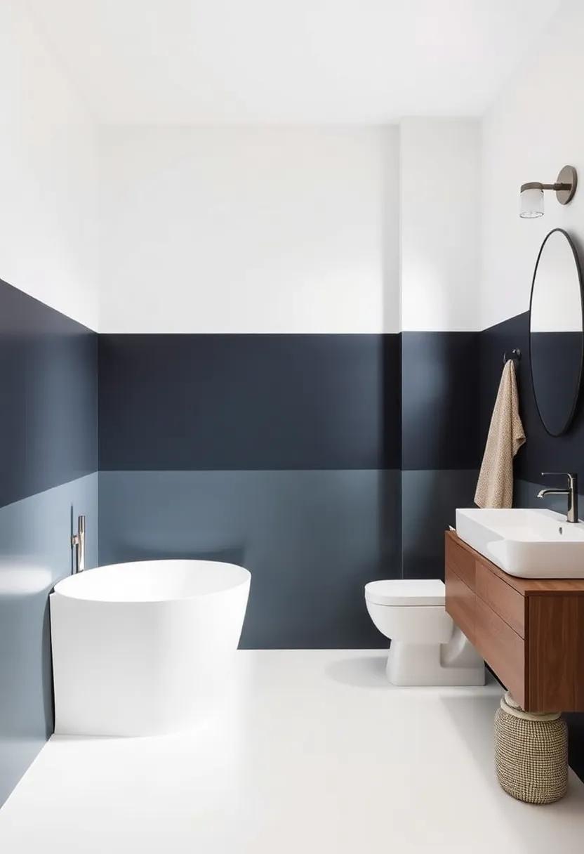
Choosing the right balance of light and dark shades can dramatically influence the atmosphere of your bathroom, transforming it into a stunning retreat. Start by considering the overall mood you want to create. Light shades tend to open up space and can create a feeling of airiness, while dark shades add depth and sophistication. Pairing these two can help in establishing contrast that feels intentional and curated. To achieve this balance, you might contemplate the following:
- Choose a dominant light color for walls and larger fixtures.
- Use dark shades for accent pieces such as cabinetry or trim.
- Incorporate natural materials like wood or stone to soften the contrast.
- Experiment with textures; matte finishes for dark colors can add warmth.
when selecting your colors, it’s beneficial to create a visual harmony. Consider utilizing a color wheel as a guide, which can ensure your choices are complementary. For example, pairing soft neutrals like cream or pale gray with deeper hues like navy or charcoal can produce a timeless elegance. Using a simple table can help visualize your options:
| Light Shades | Dark Shades |
|---|---|
| Soft White | Deep Forest Green |
| Pale Blue | Charcoal Gray |
| Warm Beige | Bold Navy |
Don’t forget to take lighting into account,as it can considerably impact how colors appear in your space. For more inspiration on color combinations and designs, you can explore resources on coloradobath.com.
Real-Life Transformations: Stunning Two-Tone Bathroom Makeover Stories
Discovering the magic of two-tone bathroom makeovers can transform not just your space, but also your mood. One stunning example is the rejuvenated sanctuary of a homeowner who opted for a sleek combination of navy blue and crisp white. This bold choice not only created a striking contrast but also made the space feel larger and more inviting. To accentuate the elegance,they incorporated gold fixtures and minimalist decor,which created a cohesive and chic atmosphere.
Another inspiring transformation featured a playful palette of soft sage green and warm beige that evoked a natural, spa-like environment. This soothing combination was paired with natural wood accents and artisan tiles, lending an organic feel to the design. Homeowners reported feeling more at ease and relaxed in their new retreat, showcasing how color choice can influence our emotional well-being.For more inspiration and tips on how to incorporate two-tone designs into your bathroom space, check out housebeautiful.com.
Budget-Friendly Solutions for Achieving a Two-Tone Look on a dime
Achieving a two-tone look doesn’t have to mean breaking the bank. Start by considering paint as a primary tool for transformation. A splash of color can make a world of difference, and paint is often the cheapest way to update your space. Opt for bold shades that resonate with your style for the upper or lower halves of the wall. You can even use painter’s tape to create clean lines and precise edges, ensuring a professional finish without the price tag. Pair your freshly painted walls with creative accents like mismatched towels and accessories in the opposite color palette to enhance the two-tone effect, tying the room together seamlessly.
Another budget-friendly approach is to look for refurbished or second-hand furniture items that can be easily restyled. As an example, a simple wooden cabinet can be revamped with a coat of paint or new hardware, allowing you to incorporate that second tone without investing in brand-new pieces. Consider using a table or seating area as a focal point to showcase your two-tone theme. Additionally, incorporating textiles, such as a two-tone shower curtain or a patterned rug, can amplify the style while keeping costs in check. For more inspiration, explore helpful resources at HGTV.
Future Trends: Two-Tone Colors Set to Dominate Bathroom Designs
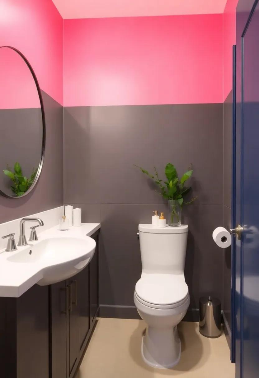
As we venture into a new era of interior design, two-tone color schemes are emerging as a vibrant trend for bathroom aesthetics.This bold approach allows homeowners to play with contrasting shades, creating a dynamic visual effect that elevates even the smallest of spaces. Imagine a serene white vanity paired with deep navy cabinets, or soft blush walls complemented by dark charcoal fixtures. This juxtaposition not only adds depth but also invites a sense of sophistication and personality into the bathroom.
When considering this trend, keep in mind how color placement can influence your space. Here are a few ideas to inspire your transformation:
- Accent Walls: Utilizing a darker shade on one wall can create an eye-catching focal point.
- Cabinetry: Mixing colors in cabinetry can harmonize modern fixtures with classic designs.
- Tiles: Two-tone tiles can add texture and depth, whether in the shower or as a backsplash.
To help you visualize these combinations, here’s a simple table showcasing some popular two-tone pairings:
| Primary Color | Accent Color |
|---|---|
| White | Slate gray |
| Light Blue | Charcoal |
| Pale Yellow | Emerald green |
As you explore the endless possibilities, don’t hesitate to seek inspiration from design resources like house Beautiful, where bold ideas and innovative designs await your revelation.
Understanding the Role of Fixtures in Two-Tone Color Schemes
In a two-tone color scheme, fixtures play a pivotal role in harmonizing the overall aesthetic of your bathroom. They not only contribute to the visual balance but also help enhance the boldness that two-tone designs bring to the space. When choosing fixtures, consider the material, finish, and style to ensure they complement the contrasting colors. Such as, sleek chrome or brushed nickel fixtures can create a contemporary feel, while vintage brass or matte black can add a touch of elegance. Pay special attention to:
- Vanity Sinks: Opt for sinks that match or contrast with your chosen tones.
- Showerheads and Faucets: Select finishes that either blend or pop against the background colors.
- Towel Bars and Mirrors: Use these elements to reflect or accentuate color themes.
The arrangement and placement of these fixtures also contribute significantly to achieving a cohesive look. Fixtures shouldn’t just function but should also act as design statements within the color dynamic. for instance, if you employ a rich navy and soft white palette, using white fixtures can enhance the airy feeling of the bathroom, while navy fixtures can provide a striking focal point. When planning your layout, keep in mind:
- Symmetry vs. Asymmetry: Decide if a balanced approach or a playful mix suits your style.
- Height and Positioning: Consider how the eye travels through the space and the visual weight each fixture brings.
- Functionality: Ensure that aesthetics do not compromise the practical use of fixtures.
To explore more ideas on combining fixtures with color schemes, you can visit House Beautiful for trending inspirations.
Accessorizing Your Two-Tone Bathroom: Finding the Perfect Finishing Touches
Choosing the right accessories can elevate your two-tone bathroom from ordinary to extraordinary. Start by considering color-coordinated towels and bath mats that complement the primary and secondary hues of your walls. Opt for striking patterns or solid colors that tie together the existing color scheme while providing a touch of softness and warmth. Adding decorative elements such as stylish vases, candles, and wall art can make a statement without overwhelming the room. Think about incorporating materials like brass or matte black for fixtures and accents, which can add a modern edge to the aesthetic.
Storage solutions are also key in creating a cohesive look. consider using open shelving in a contrasting color to showcase decorative baskets or neatly folded towels; this not only provides functionality but also adds visual interest.Furthermore, integrating plant life, whether real or faux, can introduce an organic touch that pairs beautifully with bold colors.Here’s a rapid reference table of accessories that can enhance your two-tone bathroom:
| Accessory | Purpose | Color Suggestions |
|---|---|---|
| Bath Mats | Add warmth and style | Match or contrast with wall colors |
| Wall Art | Enhance visual appeal | Complementary or bold accents |
| Storage Baskets | Organize while decorating | Natural tones or colorful options |
For further inspiration on bathroom accessories, check out The Spruce for a range of ideas that suit any project.The right finishing touches can transform your space into a serene oasis or a vibrant sanctuary, depending on your personal style.
embracing Personal Style: Infusing Unique Elements Into Your Bathroom Design
Designing your bathroom is an opportunity to express your individuality, and utilizing two-tone colors is a fantastic way to achieve that. Start by selecting a bold palette that resonates with your personal style; think rich navy paired with crisp white, or soft mint combined with deep charcoal. To further enhance the uniqueness of your space, consider incorporating decorative elements such as handcrafted tiles, statement mirrors, or vintage light fixtures that reflect your character. Mismatched towel sets or whimsical artwork can also serve as perfect accents that tie your chosen colors and personal style together.
When working with two-tone designs, consider breaking the monotony with creative patterns or shapes. This could be achieved through mixing geometric tiles on the floor while painting the walls in contrasting colors, or by installing cabinetry in one shade while opting for a lighter hue on the upper sections. Additionally, using natural elements like wood accents or plants can soften the bold color scheme, creating a harmonious yet dynamic atmosphere. For inspiration on how to seamlessly blend colors and personal touches,check out Architectural Digest for various design philosophies that celebrate individuality in interior spaces.
Navigating Lighting Challenges: Making Two-Tone Colors shine Brightly
When incorporating two-tone colors into your bathroom,the interplay of light can dramatically impact the overall aesthetic. Choosing the right lighting is essential to make these bold hues pop. Soft, diffused lighting can create warmth and highlight your selected colors, while strategically placed accent lights can draw attention to architectural features or color transitions. Consider using LED strip lights under vanities or along shelves to introduce an effortless glow, enhancing the vibrancy of your dual palette without overwhelming the space.
To maximize the effect, think about the finish of your colors. Glossy finishes can reflect light, intensifying shades and adding a shimmering quality, whereas matte finishes provide a more subdued look. It’s also worth exploring various light temperatures—warm white can add coziness, while cool white brings a modern feel. To further aid in your design decisions, using a simple color and lighting comparison table can provide insight into how different combinations interact:
| Finish Type | Light Reflection | Best Used With |
|---|---|---|
| Glossy | High | Bold Colors |
| Matte | Low | Neutral Shades |
| Satin | Medium | Earthy Tones |
To explore lighting ideas and strategies further, visit Lighting Direct for inspiration and tips tailored specifically for enhancing your bathroom makeover. Your selected colors can truly shine when paired with the right illumination techniques.
Concluding Remarks
As you embark on your journey to change your bathroom into a vibrant retreat,remember that the world of two-tone colors offers boundless possibilities. Whether you opt for striking contrasts or harmonious blends, each choice can breathe new life into your space, reflecting your personal style and creating a serene backdrop for your daily rituals. So,gather your inspiration,unleash your creativity,and embrace the power of color in your transformation. With a splash of boldness and a touch of inventiveness, your dream bathroom is just a brushstroke away.Happy decorating!
As an Amazon Associate I earn from qualifying purchases.