In the sanctuary of our homes, the bedroom serves as a personal retreat—a place where we seek solace and rejuvenation. Yet, have you ever considered how something as simple as paint can breathe new life into this sacred space? The hues that adorn your walls are not just about aesthetics; they wield the power to influence mood, evoke tranquility, and inspire creativity. Whether you’re dreaming of a serene escape or a bold statement, choosing the right paint color is crucial to crafting the atmosphere you desire. In this guide, we’ll explore the psychology of color, the latest trends, and practical tips for transforming your sleep space into a haven that reflects your style and promotes restful nights. Get ready to unleash your imagination and discover the transformative potential of color in your bedroom.
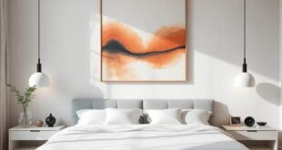
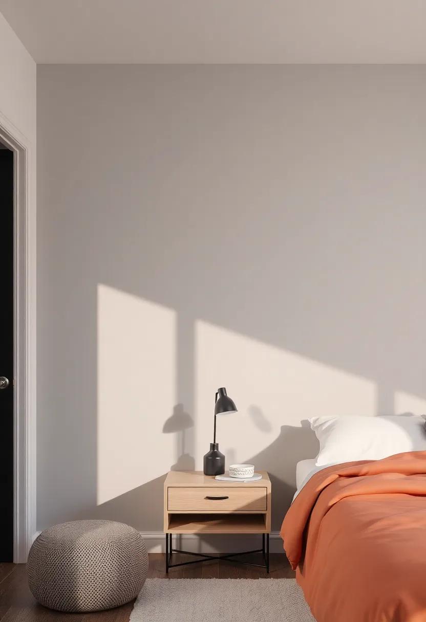
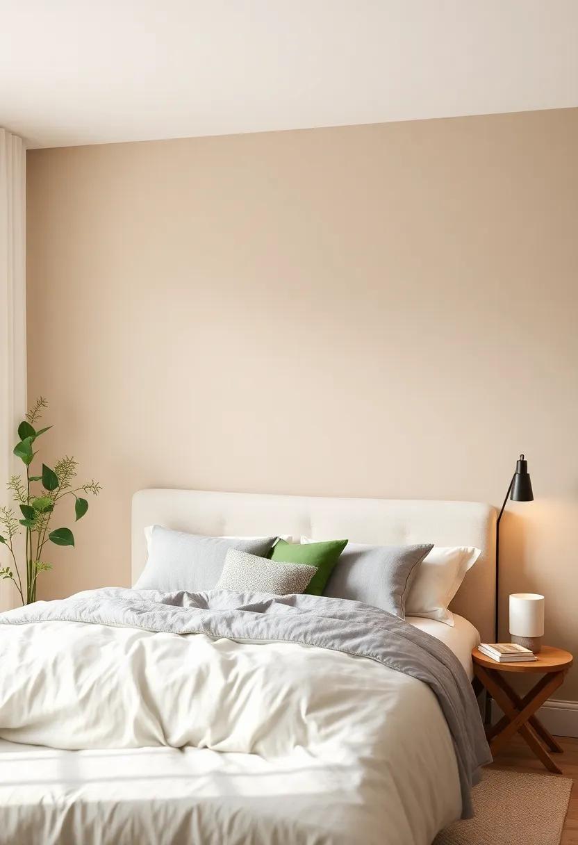
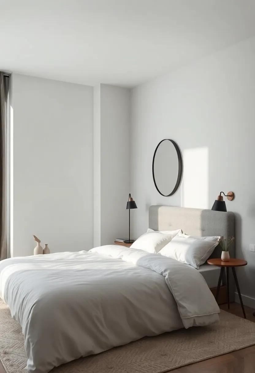
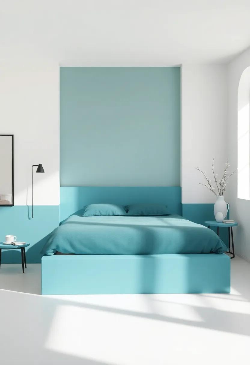
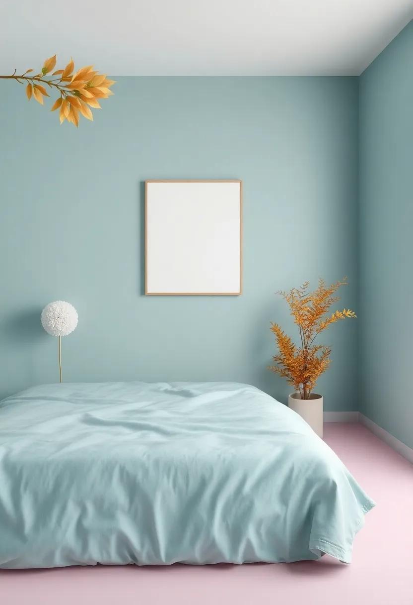
Transform Your Sleep Space With Calming Neutral Tones For A Serene Atmosphere
Creating a tranquil sleep environment is essential for a restful night. By opting for calming neutral tones, you can foster a serene atmosphere that promotes relaxation. Soft hues like muted greys, warm beiges, and gentle whites not only add sophistication but also serve to unify your room’s decor. Think about incorporating these shades into your walls, bedding, and accessories to create a harmonious space.Consider using a weighted blanket or flowing curtains in these neutral colors to enhance the overall serenity.
when it comes to furniture and accessories, embracing a minimalist approach can further amplify the peaceful vibe. You might want to choose furniture pieces in natural wood finishes or painted in soft pastels that complement your chosen palette.Here are some additional elements to consider:
- Textured Fabrics: Incorporate soft textiles like cotton or linen for bedding and cushions.
- Decorative Accents: Introduce a few carefully selected art pieces or decor items in understated colors.
- Ambient lighting: Use warm light fixtures to create an inviting glow without harsh shadows.
By synchronizing these choices, you can transform your bedroom into a calming sanctuary. For further inspiration, explore [elle Decor](https://www.elledecor.com) for ideas that perfectly align with your vision.
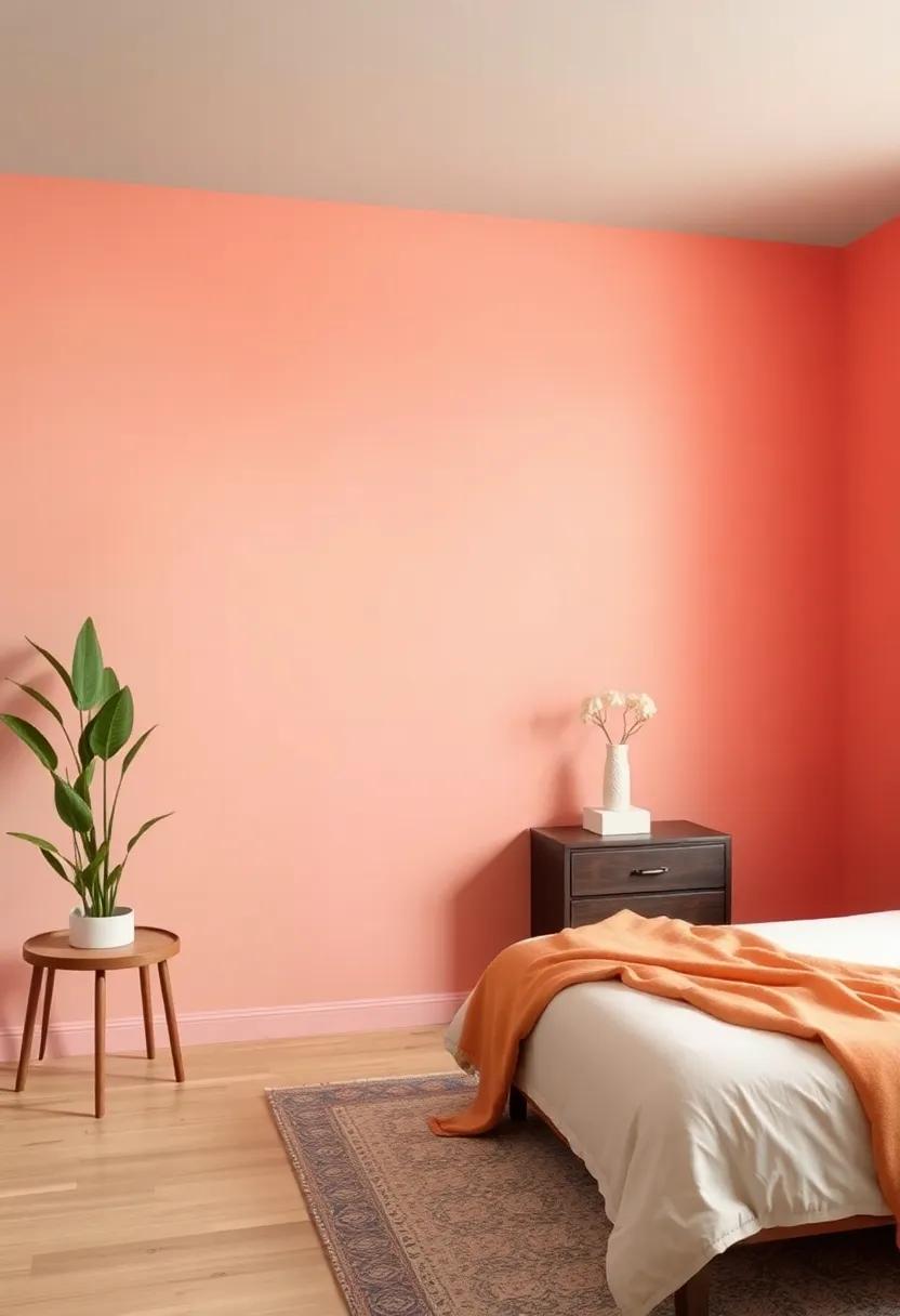
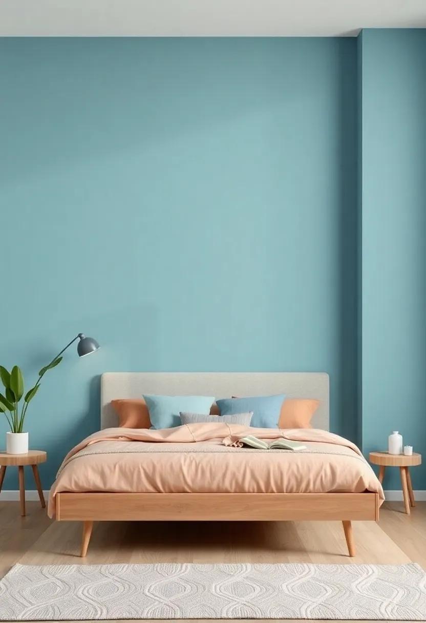
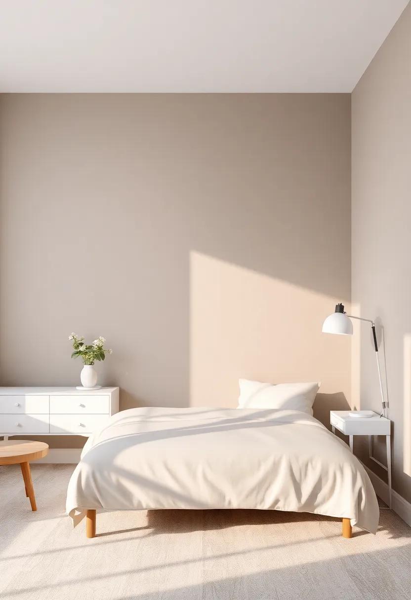
Exploring Warm Hues That Invite Comfort And Relaxation Into Your Bedroom
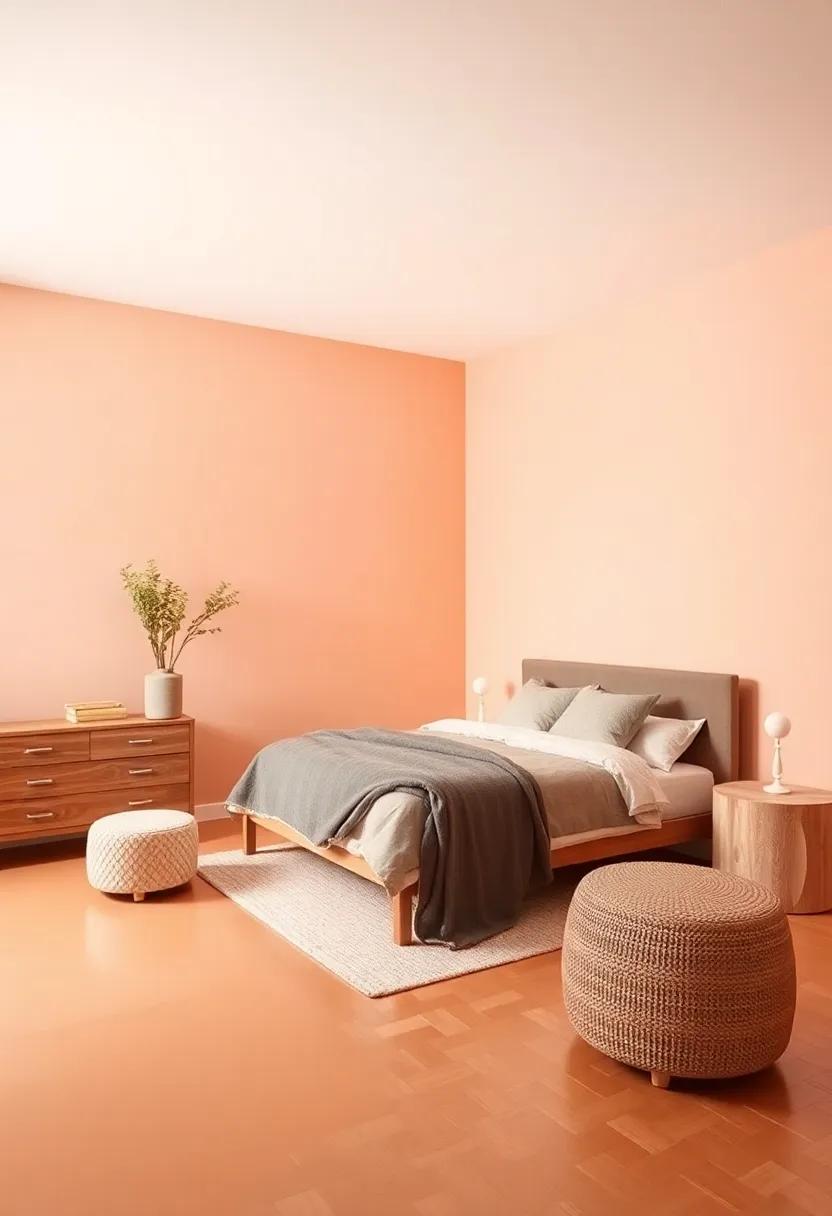
Choosing the right color palette for your bedroom can significantly impact your overall well-being. Warm hues have a unique ability to create a cocoon of comfort, encouraging relaxation after a long day. Consider incorporating shades such as soft peach,creamy beige,or muted terracotta into your design scheme. These colors not only foster a sense of tranquility but also blend beautifully with natural wood accents and cozy textiles, enhancing the inviting ambiance of your space.
To further enhance the soothing atmosphere, think about balancing warm tones with complementary elements. Soft lighting and plush furnishings can make a world of difference. Some textures to consider include:
- Velvet throw pillows for a touch of luxury
- Knitted blankets for warmth
- Jute rugs for natural texture
By thoughtfully selecting your colors and textures,you can turn your bedroom into a sanctuary that invites rest and rejuvenation. For more inspiration on color psychology, visit colorpsychology.org.
The Psychology of Color: How Different Shades Affect Your Sleep Quality
The shades that envelop your bedroom can significantly influence your mental state and overall sleep quality. Cool colors like blue and green are often associated with calmness and serenity, fostering a more restful environment. These hues naturally lower blood pressure and heart rate, which can ease you into a deeper sleep. Additionally, soft pastels can create a gentle ambiance that encourages relaxation, making them ideal choices for a tranquil haven. On the contrary, louder colors like red and orange can stimulate the mind, potentially leading to increased energy levels and restlessness at night.
When choosing the perfect color scheme for your sleep space, consider how different tones evoke emotional responses. As an example, shades of purple can promote a sense of spirituality and introspection, which might be beneficial for meditation before sleep. Incorporating neutral tones can provide a versatile backdrop that allows for personal expression through decor without overwhelming the senses. Here’s a quick reference table highlighting the emotional impacts of various colors:
| Color | Effect on Mood |
|---|---|
| Blue | Calming, promotes tranquility |
| Green | Restorative, refreshing |
| Purple | Introspective, soothing |
| Red | Stimulating, energizing |
| yellow | Cheerful, uplifting |
By understanding the psychological implications of colors, you can curate a bedroom space that not only soothes the mind but also enhances the quality of your sleep. Explore more on the effects of color at Psychology Today.
Choosing the Right Paint Finish For Ambient Bedroom Lighting Effects
When it comes to creating a serene sanctuary in your bedroom, the choice of paint finish plays a pivotal role in influencing the overall ambiance. A matte finish, for instance, can introduce a soft, velvety texture to walls, enhancing cozy lighting and inviting a tranquil atmosphere that’s perfect for winding down. Conversely, a satin finish can subtly reflect light, adding a gentle glow without overwhelming brightness, which is ideal for areas where you occasionally want a touch of vibrancy. consider the use of eggshell finishes as well; they offer a compromise between matte and satin, providing some sheen while remaining easy to clean, making them practical for any bedroom.
In order to achieve harmonious lighting effects, think about how different colors and finishes interact with both natural and artificial light sources. for example, if your bedroom is filled with soft, diffused light from windows, lighter shades like pastel blues or greens paired with a satin finish can beautifully enhance this effect.Conversely, for spaces with more direct lighting, deeper hues like navy or forest green in matte could create a cozy cocoon feeling. To further explore the synergy between colors and finishes, check out designs on resources like Houzz, which provide inspiring ideas for perfecting your restful retreat.
Creating a Cozy retreat: The Magic of Soft Pastels in Bedroom Design
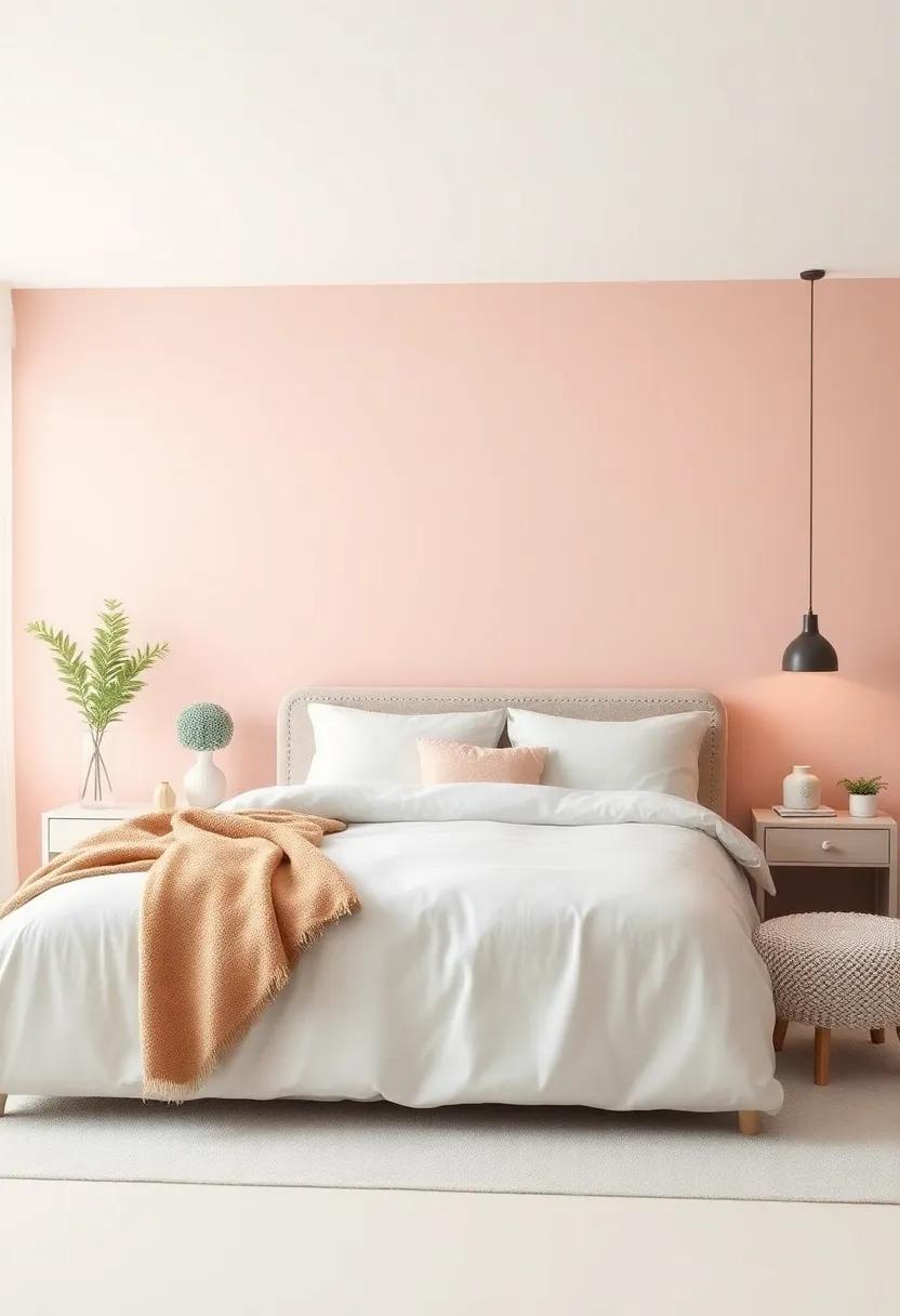
Soft pastels bring an enchanting quality to bedroom design, evoking a sense of tranquility that encourages relaxation and restful sleep. These delicate hues, like soft pinks, muted blues, and gentle greens, can enhance the overall atmosphere of your sleep space, making it a cozy haven.When thoughtfully integrated, pastel tones not only brighten up a room but also harmonize perfectly with various decor styles, from modern minimalism to rustic charm. To create an inviting environment, consider selecting pastel shades for:
- Wall Color: A soothing backdrop that sets the mood.
- Bedding and textiles: Luxurious textures that invite comfort.
- Accents and Decor: Small elements that tie the room together.
Pairing pastels with warmer accents can also create a dynamic interplay of colors, enhancing depth and visual interest in your bedroom. Soft pastel walls can be complemented with warm wood finishes or gold accents for lighting fixtures and furniture, creating a blend of cozy and chic.Don’t hesitate to introduce patterns through throw pillows or area rugs, as these can add character without overwhelming the serene palette. Consider a stylish approach by using a tonal color palette where you can play with various shades:
| Color | Emotion | Suggested Shade |
|---|---|---|
| Soft Pink | Calm & Warmth | Peach Blossom |
| Muted Blue | Peace & Serenity | Sky Mist |
| Gentle Green | Freshness & Balance | mint Whisper |
With these considerations, you can turn your bedroom into a personal retreat, evoking warmth and serenity ideal for a restful night’s sleep.For more inspiration on creating your perfect bedroom space, visit Apartment Therapy.
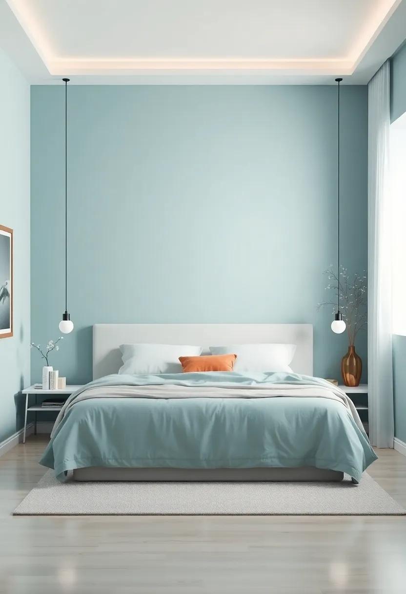
The Allure of Deep Blues: Invoking Tranquility in Your Sleep Space
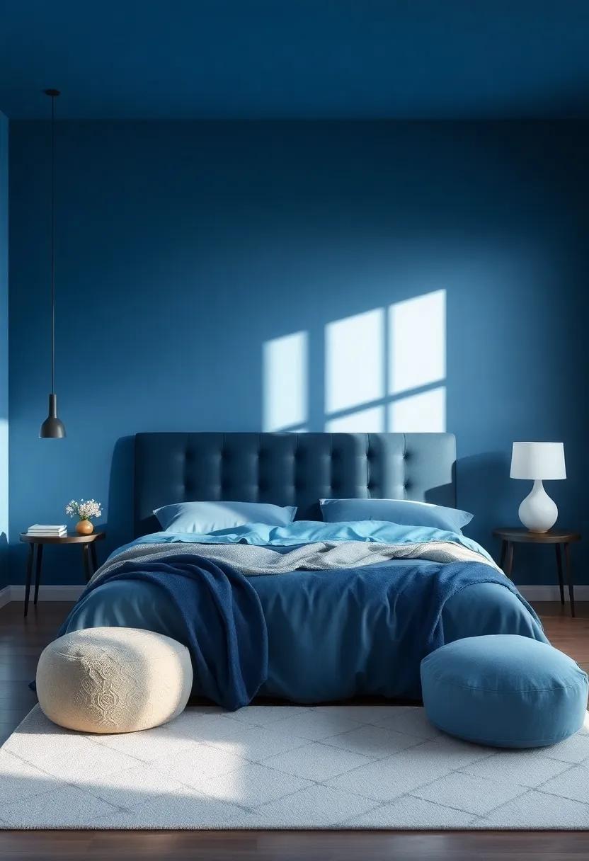
Deep blues in a sleep space create a serene atmosphere, reminiscent of calm ocean depths or a twilight sky. These shades evoke a sense of peace and tranquility, making them an ideal choice for your bedroom sanctuary. When expertly applied, blue hues can effortlessly enhance relaxation, helping to soothe the mind and body after a long day. The cool undertones can reflect soft natural light, lending a soothing ambiance that promotes restful sleep. Consider pairing deep blue walls with lighter bedding or accents to achieve balance and to create a visually appealing contrast that draws the eye.
Integrating deep blues into your bedroom design can also be a playful and creative endeavor.Incorporate textures and patterns to add depth, such as rich fabrics or artwork that features shades of blue. For a cohesive look, think about employing complementary colors like soft whites or earthy taupes to enrich your decor.By accessorizing with metallic accents or natural wood elements, you can instill an additional layer of warmth and comfort. This harmonious blend not only promotes relaxation but also encourages a refreshing atmosphere where dreams flourish. Explore various shades and find inspiration on platforms like decorilla.com for innovative ideas.
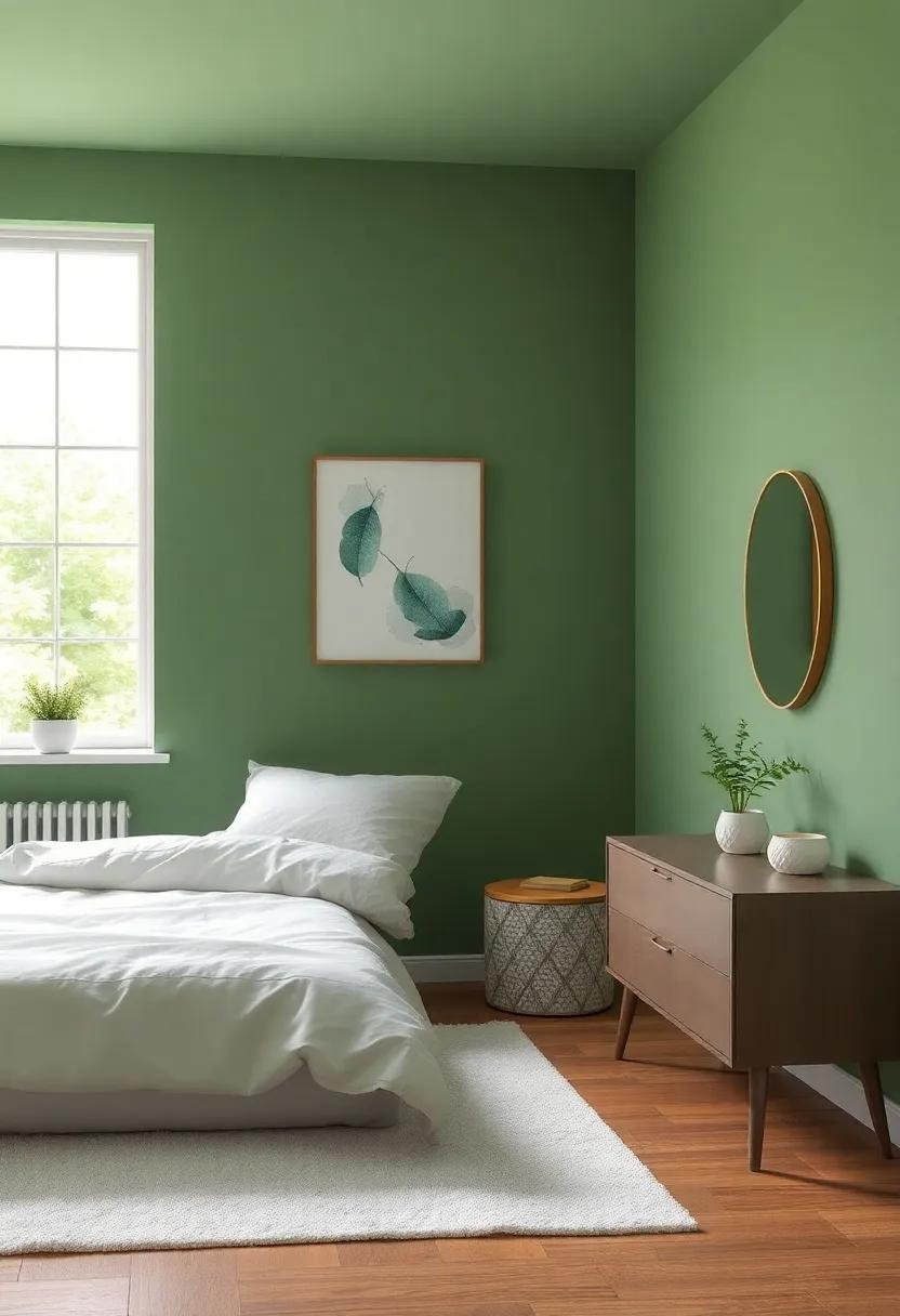
Nature-Inspired Bedroom Colors That Bring The outdoors Inside
Infusing your bedroom with earthy tones can create a soothing, tranquil environment that feels in harmony with nature. Consider using soft shades like sage green or sky blue for your walls, mimicking the calming hues of a serene landscape. You could also explore deeper tones such as forest green or rich terracotta which evoke the essence of a wooded retreat or sun-baked earth. These colors not only enhance the aesthetic of your space but also promote relaxation and rejuvenation,making your bedroom a sanctuary where you can unwind after a long day.
To further bring the outdoors inside, complement your chosen color palette with natural materials and textures. Incorporate elements such as wooden furniture, woven textiles, and stone accents, which can enhance the organic feel of your retreat. Add touches of soft white or creamy neutrals to balance these colors, providing a gentle contrast that keeps the space feeling light and airy. Don’t forget to incorporate indoor plants, which can enhance the natural vibe and improve air quality, making your bedroom not just a place to rest, but a true escape into nature. For more inspiration on natural colors,check out colorpsychology.com.
Dramatic Dark Shades: Designing with Intensity and Cozy Vibes
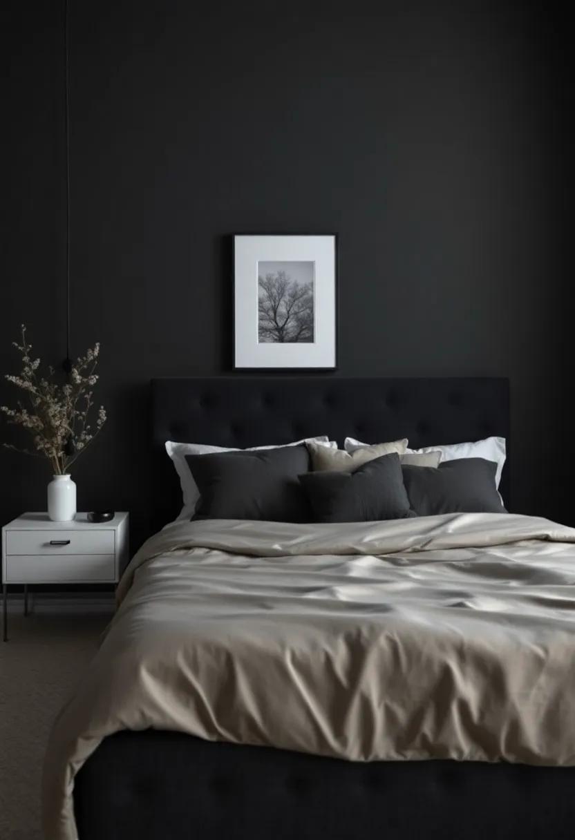
When it comes to leveraging the power of dramatic dark shades in your bedroom, the key lies in balancing intensity with a sense of warmth and comfort. Deep hues such as charcoal gray, navy blue, and forest green can envelop your space in a cozy atmosphere while adding a touch of sophistication. These colors not only create a striking backdrop but also invite a sense of tranquility, making them perfect for a sanctuary meant for rest. To enhance the cozy vibes, consider pairing these darker tones with soft, textured fabrics like velvet or a chunky knit throw. the contrast will not only soften the room’s overall look but also add layers of comfort that beckon relaxation.
Incorporating lighter accents is crucial when working with these bold palettes. A few impactful choices include:
- White or cream bedding to brighten the space
- Wooden furniture to introduce warmth
- Gold or brass fixtures for a touch of elegance
Additionally, the use of mirrors can definitely help reflect light, making the room feel more spacious despite the dramatic wall color. A well-placed mirror can also serve to highlight your choice of dark paint, creating a dynamic focal point in the room. Explore combinations and experiment with various textures until you achieve a harmonious blend that resonates with your personal style. For more inspiration, check out Houzz where you can find an abundance of ideas to refine your aesthetic.
Energizing Accent Colors That Inspire Creativity And Joy
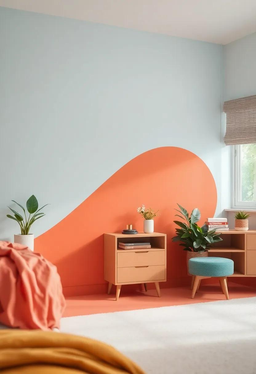
Choosing the right accent colors for your bedroom can dramatically influence your mood and inspire creativity. Luminous and vibrant hues can easily transform a dull space into an energetic sanctuary. Consider incorporating colors like sunny yellow, vibrant turquoise, or playful coral to evoke feelings of joy and stimulate your imagination. Pair these lively shades with neutral tones to create a balanced yet uplifting atmosphere. Utilizing colorful throw pillows, artwork, or even a feature wall can seamlessly blend these energizing accents into your sleep space.
To ensure your chosen colors harmonize well, think about the overall vibe you wish to achieve. Utilize the color wheel to explore complementary combinations that resonate with your personal style. Here’s a simple guide to help you mix different accent colors effectively:
| Base Color | Energetic Accent Color | Vibe |
|---|---|---|
| Soft Gray | Vibrant Orange | Playful & Energetic |
| Warm Beige | Sunny Yellow | Cheerful & Bright |
| Pale Blue | Bright green | Refreshing & Invigorating |
Remember, the goal is to create a sanctuary that lifts your spirits and sparks joy. For more inspiration and color ideas, check out Behr for a wealth of resources tailored to transforming your living space.
Layering Complementary Colors For A Harmonious Bedroom Palette
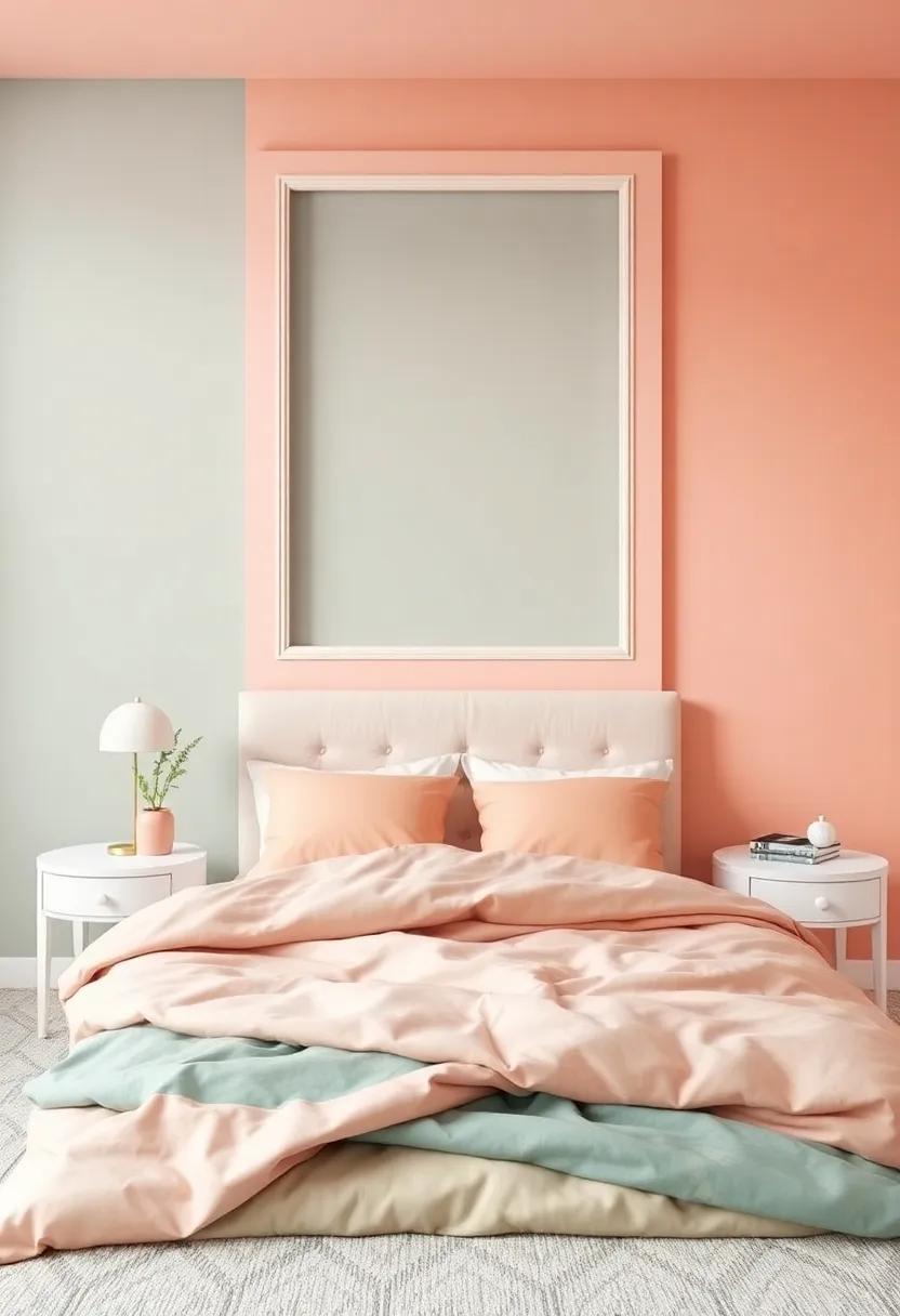
To create a bedroom that exudes tranquility and style, utilizing complementary colors can yield a visually striking and harmonious outcome. Start by selecting one dominant color that resonates with your personal taste. Soft blues and gentle greens are soothing options that can set a serene backdrop. Pair these with complementary shades such as coral or peach, which will add just the right touch of vibrancy without overwhelming the space. The key to success lies in balancing the intensity of these colors—aim for lighter tones of your primary choice alongside slightly bolder accents, ensuring a cohesive feel throughout your decor.
When layering these complementary shades,consider the following elements for a stunning finish: furniture,textiles,and accessories. Incorporate textiles that showcase both colors, like a bedspread featuring subtle peach patterns against a soft blue background. You can introduce accents through throw pillows or artwork, creating a cohesive narrative. To maintain harmony, use a color wheel to guide your selections, ensuring that every piece complements rather than clashes. For some visual inspiration,explore Pantone’s color insights, which can definitely help you discover trending palettes and provide guidance on the best combinations to use in your space.
Balancing Light and Dark: The Art of Contrast in Bedroom Design
Achieving harmony in your bedroom design often revolves around the interplay of light and dark elements. When selecting paint colors, consider how the hues can evoke different feelings and atmospheres. Light colors such as soft whites or pale pastels can create a sense of airiness and openness, while dark tones like deep blues or rich greens can evoke a cozy, intimate environment. To effectively balance these contrasting colors, you can employ them in varying proportions, creating a dynamic flow within the space. As an example, using light colors on the walls paired with dark furniture can provide a striking backdrop that enhances both elements, making your bedroom a sanctuary that invites tranquility while adding depth and interest.
To further refine your space, think about incorporating textures and accents that complement your chosen palette. Integrating elements like fluffy throw pillows, woven blankets, or sleek metallic decor can add layers to your design, enhancing the visual contrast. Additionally, consider the impact of natural light—how it dances across different surfaces at various times of the day—and how this interplay influences the colors you’ve chosen.Here’s a quick reference table for selecting the right contrasts based on your desired mood:
| Desired Mood | Suggested Light Colors | Suggested Dark Colors |
|---|---|---|
| Calming | soft White | Charcoal Gray |
| Cozy | Pale Beige | Rich Navy |
| Modern | Cool Mint | Deep Teal |
exploring these contrasting elements can transform your bedroom into a beautifully balanced retreat. For more insights on color theory and design ideas, check out Houzz, where you can find a wealth of resources to inspire your next decorating project.
choosing a Color Scheme That reflects your Personal Style and Mood
When it comes to selecting a color scheme for your bedroom, it’s essential to consider how each hue influences your emotions and reflects your unique personality.A cool palette with soothing blues and gentle greens can evoke a sense of tranquility, perfect for fostering restful sleep. In contrast, warmer tones like soft yellows and corals may inject a sense of energy and warmth, creating a cozy atmosphere. Think about the mood you want to cultivate; a serene retreat often calls for softer shades, while a more vibrant environment might benefit from a splash of color. Explore different color combinations to find the perfect balance that resonates with your individual flair.
To assist you in discovering the right colors for your personal style, visualize how they can interact within your space. Consider creating a mood board with the following elements:
- Primary Color: The main color that will dominate the room.
- Accent Colors: Two or three shades to complement the primary color and add depth.
- Neutral Shades: These help to ground the space and provide a backdrop for bolder tones.
Additionally, the lighting in your bedroom plays a crucial role in how colors are perceived.A soft, diffused light can enhance the warmth of your palette, while harsher lights might highlight the cooler shades, so always test paint samples in various lighting conditions. For more inspiration on color psychology, visit Color Psychology.
Textures That Transform: Incorporating Paint Techniques for Visual Interest
When it comes to bedroom aesthetics, the right paint techniques can elevate your space from ordinary to remarkable. Consider using ombre effects, where colors seamlessly blend from one shade to another, creating a serene gradient that adds depth to your walls. Alternatively, sponging and rag rolling can introduce texture, providing a tactile quality that draws the eye and invites touch. These techniques allow for a personalized expression that reflects your style while enhancing the atmosphere of relaxation essential for a sleep space. to further deepen the visual interest, you might think about incorporating metallic finishes or chalkboard paint in specific areas, offering a functional yet artistic flair.
As you select your preferred paint technique, you may also wish to consider the impact of light on your choices. Using a matte finish for softer, subtler colors can diffuse harsh light, creating a cozy ambience, while satin or gloss finishes can reflect light, making spaces feel larger and brighter. Here’s a simple reference table to help you visualize some popular techniques and their effects:
| Technique | Effect | Best For |
|---|---|---|
| Ombre | Smooth gradient | Calming atmosphere |
| Sponging | Textured finish | adding depth |
| Metallic | Reflective shine | Luxurious look |
| Chalkboard Paint | Interactive surface | Creative expression |
Ultimately, the beauty of these paint techniques lies in their ability to transform your bedroom into a unique sanctuary. for more inspiration and detailed guides on paint styles, visit Better Homes & Gardens.
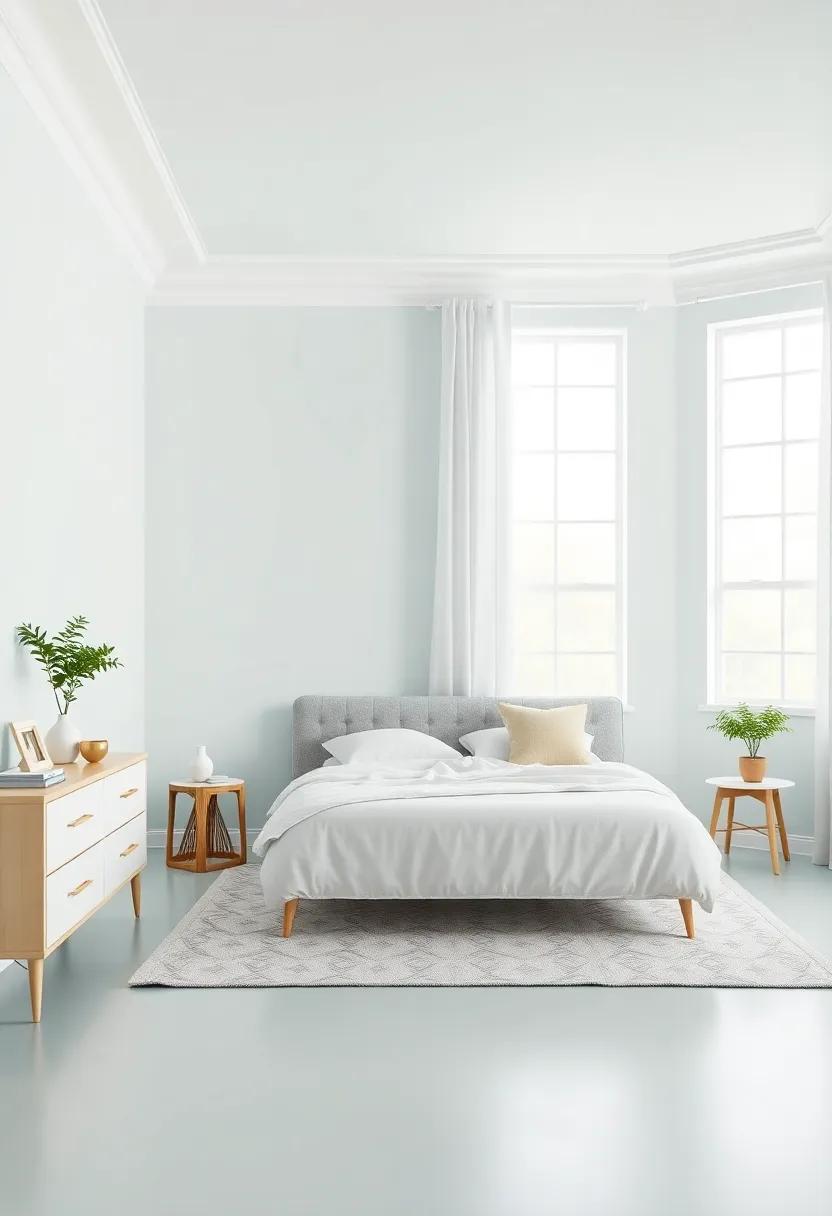
Imagining Open Spaces: Using Lighter Shades to Enhance Room Dimensions
Choosing lighter shades for your bedroom walls not only creates a tranquil environment but also plays an essential role in making your space appear larger than it is. Soft pastels and muted tones also foster an airy feel,encouraging a serene atmosphere that promotes restful sleep.Consider options like light blues, gentle greens, or soft creams that can also beautifully reflect natural light, enhancing the overall luminosity of your room. When paired with the right furnishings and decor, these shades can transform even the coziest spaces into expansive retreats.
Incorporating lighter colors provides a blank canvas for you to experiment with patterns and textures that can further enrich your sleeping quarters.You might consider adding elements such as:
- White bedding for a fresh and clean contrast
- Wood accents that bring warmth without overwhelming the light palette
- Mirrors to reflect light and give the illusion of depth
By thoughtfully selecting lighter hues, you’re not merely painting a wall; you’re crafting an experience tailored to relaxation and rejuvenation. Embrace the potential of these colors to shape a harmonious space that feels larger, brighter, and infinitely more inviting. For more inspiration and tips, check out Houzz.
Transforming Your Sleep Environment With Biophilic Design and Green Tones
Incorporating biophilic design into your sleep environment can create a serene and calming atmosphere that promotes rejuvenation. By integrating natural elements, you can evoke a sense of peace and connection to nature, which is essential for any restful night’s sleep. Here are some suggestions to transform your bedroom with a touch of greenery:
- Natural Materials: Use wood,stone,or wicker furnishings to bring an earthy feel to the space.
- Plants: Incorporate indoor plants such as snake plants,peace lilies,or ferns,which purify the air and enhance the aesthetic.
- Natural Light: Maximize natural light through large windows or sheer curtains to create an open, airy environment.
When it comes to color, green tones can significantly influence your mood and sleep quality. Shades of green resonate with nature and promote relaxation, making them an ideal choice for a bedroom palette.Consider the following color variations for your walls:
| Shade | Effect |
|---|---|
| Mint Green | Invigorating and refreshing; encourages tranquility. |
| Sage Green | Soft and calming; evokes a sense of serenity. |
| Forest Green | Deep and grounding; promotes relaxation and introspection. |
By consciously selecting colors and designs that reflect nature, you can create a peaceful sanctuary in your bedroom that fosters better sleep. For more tips on designing with nature in mind, check out NAIOP.
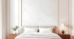
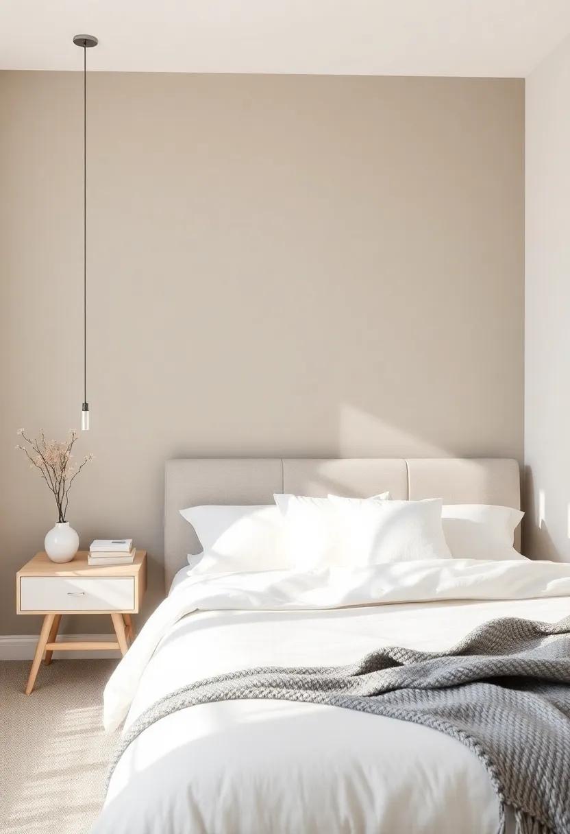
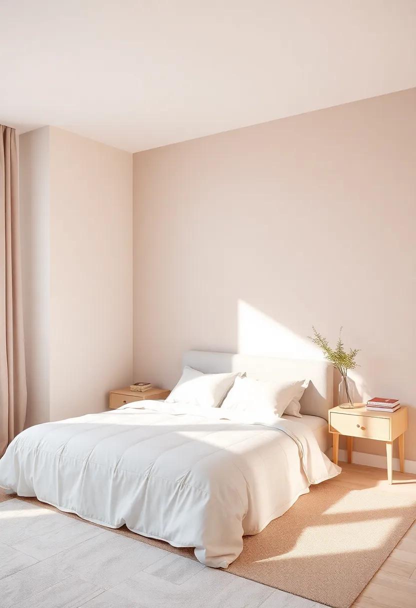
Creating the Perfect Backdrop: Neutral Shades For Furniture and Decor
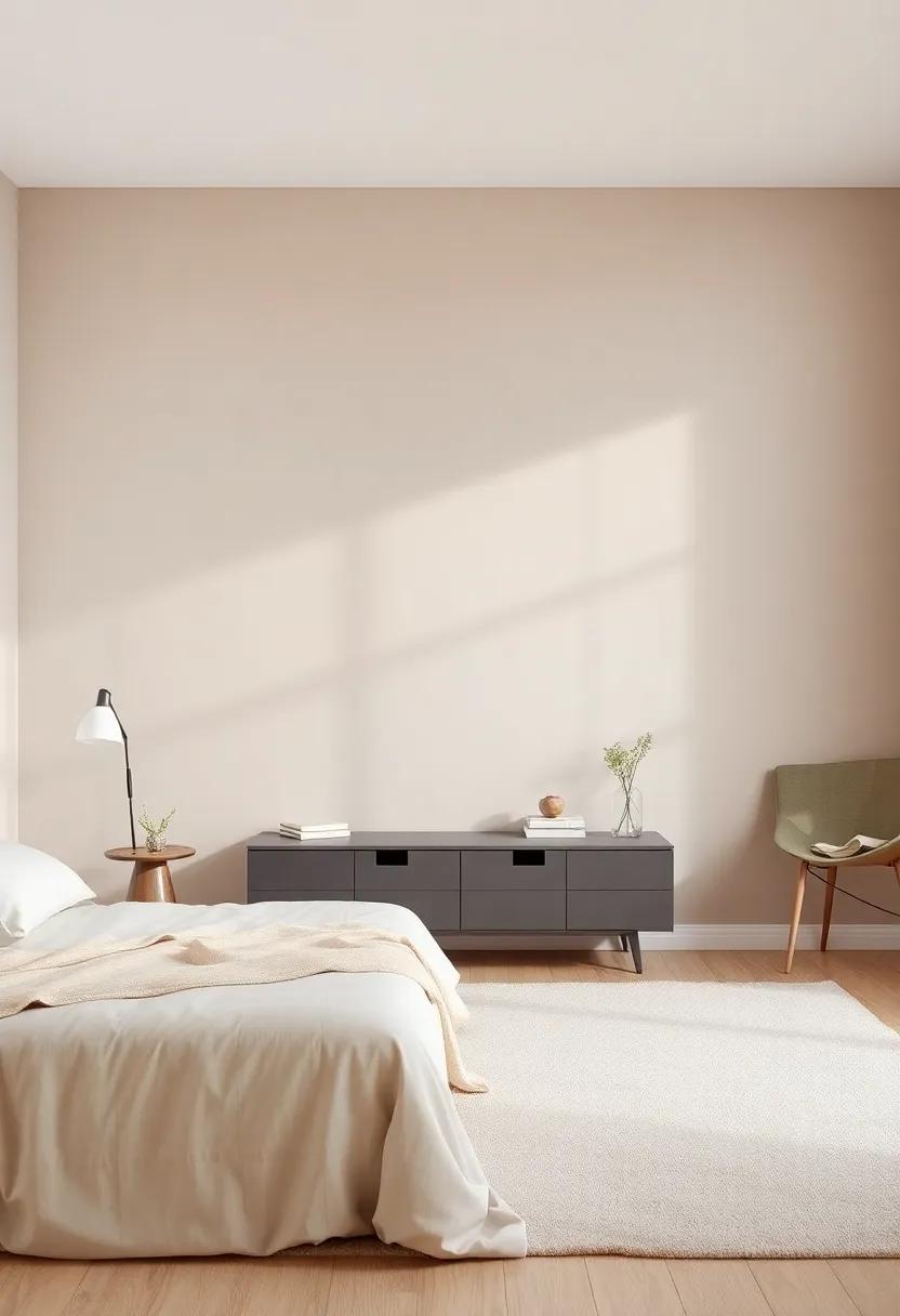
When it comes to infusing your bedroom with tranquility, neutral shades are the ultimate choice. These versatile colors serve as a backdrop that harmonizes with a variety of furniture and decor elements, allowing your space to exude serenity. consider incorporating hues such as soft beiges, muted greys, or even gentle taupes. These colors create a cohesive canvas that can effortlessly accommodate various styles, whether you’re drawn to vintage charm or modern elegance. Additionally, neutral shades have the magical ability to make the space appear larger and more inviting, which is perfect for bedrooms that might feel a little cramped.
Integrate textures and materials to enhance the neutral palette. From plush throws to wicker baskets, the combination of different textures can add depth to your decor. When accessorizing, think about utilizing elements such as:
- Wooden Accents: Warm wood tones can effortlessly complement neutral walls.
- Metallic Touches: subtle metallics, like brushed brass or matte black, can provide a sophisticated contrast.
- Textiles: Layering various fabrics, like velvet and linen, adds visual interest.
For those wanting to dive deeper into this aesthetic, visit House Beautiful to explore more ideas and inspiration on neutral decor. The right balance of shades and textures will not only define your bedroom’s personality but also create a peaceful haven you’ll love retreating to.
Mood-Enhancing Bedroom Colors to Foster Relaxation and Rejuvenation
Creating a sanctuary that promotes rest and rejuvenation involves more than just selecting the right mattress; the colors of your walls can profoundly influence your mood and overall well-being. Soft, earthy tones such as sage green and muted lavender are frequently enough favored for their calming effects. These hues evoke a sense of nature and tranquility, making them ideal for a serene sleep environment. Consider adding touches of soft blue or pale yellow to bring warmth and cheerfulness into the space without overwhelming the senses.
For those who prefer something more dramatic yet soothing, deep shades like charcoal gray or navy blue can create an enveloping effect, reminiscent of a cozy night sky. To add visual interest, you might incorporate an accent wall or textiles that complement your chosen palette.Remember to balance darker hues with lighter, decorative elements, such as curtains or bedding in shades of white or cream. Ultimately, the goal is to create a harmonious atmosphere that invites relaxation and rejuvenation, enhancing your overall sleep quality. for more ideas on color psychology,visit Psychology Today.
Utilizing Color Theory to Craft a Relaxing Bedroom Sanctuary
Creating a serene atmosphere in your bedroom begins with an understanding of color theory and its impact on mood and relaxation. Soft hues such as light blues, gentle greens, and muted purples evoke feelings of tranquility and are often associated with peaceful environments. Consider opting for a wall color that embraces these shades to help facilitate a restful state of mind. Incorporating accent colors can also add depth to your space; as a notable example, warm neutrals like taupe or soft beige can complement cooler tones and provide a grounding effect within the room.
Along with wall colors, pay attention to the accessories and textiles you choose. when selecting bedding or curtains,aim for colors that harmonize with your painted walls to create a cohesive look.Textures also play a notable role in the overall ambiance; materials that are soft and inviting can enhance the calming vibe. For a quick reference, consider using the following colors and their associated effects as a guide:
| color | Mood |
|---|---|
| Soft Blue | Calming and serene |
| Light Green | Refreshing and rejuvenating |
| Lavender | Soothing and comforting |
| Cool Gray | balanced and modern |
For further insights on color psychology and its effects on well-being, check out Color Psychology.
Setting the Scene: Discovering Cohesive Color Ideas For Bedroom Elements
Choosing the right color palette for your bedroom can transform the space into a calming retreat. As you embark on this vibrant journey, it is indeed essential to consider both the mood and the elements in the room. think about how colors interact with your bedroom’s furniture, decor, and flooring.For a harmonious blend, consider the following color relationships:
- Monochromatic Schemes: Use variations of a single hue to create depth while maintaining unity.
- Analogous Colors: Select colors that sit next to each other on the color wheel for a soothing effect.
- Contrasting Pairings: Combine bold colors with softer tones to add interest and energy.
To help visualize these concepts, creating a color inspiration board can be quite useful. Pair your chosen colors with elements such as bedding, wall art, and window treatments to see how they interact. Below is a simple table to help guide your color selections:
| Color Scheme | Best For | Examples |
|---|---|---|
| Monochromatic | Calm, Minimalist Styles | Shades of Blue: Navy, Sky, Ice |
| Analogous | Cozy, Welcoming Spaces | Warm tones: Red, Orange, Yellow |
| Contrasting | Vibrant, Energetic Atmospheres | Complimentary: Teal & Coral |
As you explore these cohesive color ideas, remember that natural light and room dynamics play a significant role in how colors are perceived. Be sure to test paint samples in different lighting conditions before making a final decision. For more inspiration on color combinations, you can visit ColorMuse, where you can experiment with shades that suit your unique style.
Personalizing Your Retreat: Unleashing Creative Color Choices in Your Space
Creating a personal sanctuary in your bedroom goes beyond just a cozy mattress and soft linens—it hinges on the transformative power of color. As you delve into the world of paint choices, it’s essential to think about how different shades can influence your mood and daily rhythms. Warm tones, such as soft yellows and beige, can invoke a sense of coziness and comfort, making them ideal for creating a welcoming atmosphere. In contrast, cool hues like blues and greens can promote relaxation and tranquility, turning your space into a serene retreat. Consider also the lighting—both natural and artificial—as this will affect how colors appear on your walls throughout the day.
To craft a personalized ambiance,draw inspiration from the things you love,whether it’s nature,travel,or your favorite quotes. You might find that a color palette can emerge from a piece of art, fabric, or even a stunning sunset. When selecting your hues, consider these impactful strategies:
- Accent Walls: Use a bold color on one wall to create a focal point.
- Layering Shades: Combine various shades of the same color for depth.
- The Power of Neutrals: Balance brighter colors with neutral tones to allow them to shine.
Incorporating textures, such as soft textiles or wooden accents, can also enhance the overall feel of your painted space. To gain further insights on color choices, visit Color Psychology, where you can explore how specific colors can impact your emotions and choices. Remember, personalizing your retreat isn’t just about aesthetics; it’s also about creating an environment that reflects who you are and how you want to feel when you step into your sleep space.
Visualizing Your Bedroom as a Canvas: Embracing Artistic Expressions through Color
your bedroom is more than just a place to sleep; it’s a sanctuary where your personality can shine through. By treating your room as a canvas, you have the possibility to create an environment that reflects your inner self. Begin by considering the emotional responses that different colors evoke.Soft blues and gentle greens can promote a sense of tranquility, while warm yellows and corals infuse an energetic warmth into the space. As you explore colors,think about incorporating accents that complement your chosen palette—perhaps a few bold pillows or an artistic print on the wall.
To embark on this creative journey, consider these artistic elements in your design:
- Accent Walls: A vibrant wall can serve as a stunning focal point.
- Color Gradients: Blending shades can create a soothing transition.
- Artwork: Incorporate pieces that speak to your style and inspire you.
Additionally, keeping a harmonious balance between colors will help in maintaining a peaceful atmosphere. A simple color wheel can be an excellent tool to visualize how different shades interact. To dive deeper into color psychology and its effects on mood, take a look at resources from Color Matters.
Selecting Color Combinations That Inspire Peace and Tranquility
when selecting hues for your sanctuary,consider colors that evoke feelings of calmness and serenity. Pastel shades like soft blues, gentle greens, and light lavenders can create an environment that soothes the mind. These colors mimic the tranquility of nature, reflecting skies and lush landscapes, which can help foster a sense of peace. Additionally,you can enhance your sleep area by incorporating deeper tones like navy or forest green as accent colors,bringing depth without overwhelming the space.
To truly embrace an atmosphere of relaxation, the key lies in harmony. Combining complementary shades can help achieve this balance. Here are some suggestions to inspire your palette:
- Pale Blue + Warm Beige
- Seafoam Green + Soft White
- Dusty Lavender + Cool Gray
- Navy + Mustard Yellow Accents
You can also utilize color psychology as a guide for your choices.For further insights on color effects, visit Color Psychology Today. Remember to test out your selected shades with samples on your walls,as different lighting throughout the day can dramatically alter the look and feel of your chosen colors.
Exploring Innovative Color Palettes to Reflect Changing Seasons In Your Space
As the seasons shift, so too does the palette we’re drawn to in our living spaces. Embracing this fluidity allows for a vibrant and dynamic bedroom atmosphere. Consider soft pastels for spring, reminiscent of blossoming flowers; hues of warm earth tones in summer that evoke the feeling of sun-drenched days; and the rich, deep colors of autumn that instill a sense of coziness as the air turns crisp. In winter, opt for cool blues and whites, capturing the serene tranquility of snowfall. This seasonal approach not only keeps your space fresh but also mirrors the natural beauty around us.
To help visualize and implement these ideas, here are some suggested color palettes for each season:
| Season | Palette |
|---|---|
| Spring | Soft Pink, Light Green, Sky Blue |
| Summer | coral, Sunny yellow, Sky Blue |
| Autumn | Burgundy, Mustard Yellow, Olive Green |
| Winter | Icy Blue, Charcoal Gray, Snow White |
Mixing and matching these colors can create a harmonious vibe, tailored to your personal taste and mood. For more inspiration, you might explore Design-Seeds, a wonderful resource for finding unique color combinations that resonate with each season.
the Impact of light on Color Perception: how to Select Wisely for Your Bedroom
Understanding how light interacts with color can significantly enhance the atmosphere of your bedroom. For instance, natural light can bring out the vibrancy of certain hues, while artificial lighting can alter how colors are perceived throughout different times of the day. When selecting a paint color, consider the type of lighting in your space—warm LEDs might soften bold colors, whereas cool daylight bulbs can make any shade feel more vivid. To create a serene and restful environment, lean towards softer hues such as pastel blues or gentle greens, which promote relaxation, especially when paired with warm lighting.Conversely,bright or saturated colors can energize a space,making them ideal for a lively sleep environment.
Additionally, it’s essential to factor in the direction your bedroom faces when choosing colors. For north-facing rooms, which tend to receive cooler, dimmer light, warmer colors like light peaches or warm taupes can create an inviting atmosphere. In contrast, south-facing rooms bask in warm, natural light, so cooler shades like soft grays or calm blues can enhance the natural glow without overwhelming the space. To help visualize how different colors might look at various times of the day, consider creating a small color swatch in the room, observing how it changes from morning to evening under different light conditions. For more insights on color psychology and perception, explore resources like Color Psychology.
Final Thoughts on Curating the Ideal Color Palette For Your Sleep Oasis
In crafting the perfect color palette for your sleep oasis, consider how various hues interact with light and space.Soft neutrals, like beige and soft gray, create a tranquil backdrop that can be easily accessorized with bold pops of color. These calm colors help to establish a sense of serenity, inviting restfulness at day’s end. For a more vibrant touch, cool blues and gentle greens can mimic the tranquility of nature, promoting a peaceful atmosphere ideal for relaxation.Complementary accents, such as warm woods or metallics, can elevate the overall ambiance and add layers of depth to your design.
Remember, the ideal palette is not only about aesthetics but also about aligning with your personal preferences.it’s crucial to test paint samples in different lighting conditions, as colors may shift in tone throughout the day. Consider creating a mood board that brings together fabric swatches, color samples, and decor items that inspire you. This will ensure that your choices resonate with your vision for the space. Utilize resources like Houzz to gather ideas and find a community of like-minded individuals who share your passion for design. Ultimately,your sleep oasis should reflect your unique style while providing a soothing retreat from the outside world.
The Way Forward
As you embark on your journey to transform your sleep space, remember that the right paint color can do wonders for your overall well-being. Whether you seek the calming embrace of soft blues, the cheerful warmth of sunny yellows, or the sophisticated allure of deep greens, your choices will shape not just the aesthetics of your room, but also its energy and ambiance.By taking the time to consider the emotional impact of color and how each hue interacts with the light and decor in your bedroom, you are setting the stage for restful nights and invigorated mornings. So grab that paintbrush, experiment with swatches, and let your creativity flow. your ideal sanctuary awaits—one stroke at a time. Sweet dreams!
As an Amazon Associate I earn from qualifying purchases.