
Most shopping choices are made in seconds, guided more by sight than careful reading. A familiar container, a recognizable shape, and a trusted brand often signal value before we ever check the label. Our brains are wired to rely on visual shortcuts, especially in busy aisles where decisions happen quickly. That’s why a recent dispute in the spice aisle has sparked conversation—it reveals how subtle design choices can influence perception and affect consumer trust.
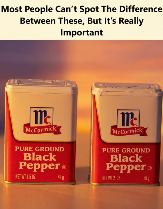
The first step to understanding this issue is recognizing how consistency affects expectations. When a product’s packaging looks the same as it always has, shoppers naturally assume the contents haven’t changed. If a container keeps its familiar size and shape but quietly holds less product, that assumption can be misleading, even if the label technically lists the correct amount. Habitual purchases rely heavily on memory, and visual sameness reinforces the belief that value remains unchanged.
Next, consider how visibility plays into perceived value. Clear containers allow shoppers to instantly judge quantity, while opaque packaging removes that visual reference. In those cases, size and proportion do the talking. A larger-looking container can feel like a better deal at a glance, even when the numbers say otherwise. In real-world shopping conditions—crowded shelves, limited time—design often outweighs detailed comparison.
Finally, the broader lesson is about awareness and trust. Packaging isn’t just decorative; it communicates messages that shape expectations. When those messages feel unclear or inconsistent, confidence in a brand can erode, even if no rules are broken. For consumers, slowing down and checking details can prevent surprises. For brands, transparency matters. Small design decisions can carry big implications, and in a world driven by quick choices, what’s implied visually can matter just as much as what’s written in fine print.