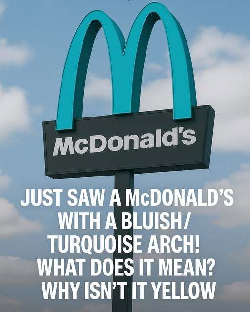
Visitors to Sedona usually arrive expecting red rock cliffs, desert calm, and sweeping views—but many do a double take when driving along Highway 89A. Tucked into the scenery is a McDonald’s that looks noticeably different from any other. Instead of the iconic golden arches, this location features arches painted a vivid turquoise, instantly setting it apart and sparking curiosity.
The story behind the unusual design is rooted in Sedona’s long-standing dedication to protecting its natural beauty. When McDonald’s planned to open a restaurant in the early 1990s, the city’s strict design guidelines required new buildings to blend into the surrounding landscape. Bright colors, reflective materials, and visually dominant signage were discouraged, as local leaders wanted commercial development to respect the area’s distinctive visual character.
After negotiations between city planners and the company, turquoise emerged as a thoughtful compromise. The color holds deep cultural significance in the Southwest and is closely tied to regional art, jewelry, and history. Combined with earth-toned architecture, the softer hue allowed the restaurant to remain recognizable without clashing with Sedona’s red rock backdrop or overwhelming the scenery.
Rather than feeling out of place, the turquoise arches quickly became a local favorite and an unexpected attraction for travelers. Visitors often stop for photos, and residents view the restaurant as an example of how global brands can adapt to local values. In a world dominated by uniform corporate design, Sedona’s blue-arched McDonald’s stands as a reminder that respecting place and culture can turn even a fast-food stop into something memorable.
